Sunday, December 25, 2011

Typography: Merry Christmas and Season's Greetings


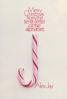
My Christmas card from 1977 was printed by letterpress.
The typography was made with Letraset transfer type,
and is from the Kabel family. I glued a candy cane to the
card. Some cards were hand-delivered. To mail the cards,
I constructed, out of foam board, a protective case, then
inserted it in an envelope. Most cards arrived intact. The
image is an enhancement of a slightly faded photograph.
The card measured 4.125 by 6 inches / 10.5 by 15.2
centimeters. Below is the letterpress type block.


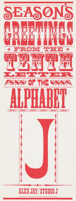
Many years later I revised the card design and wording.
I used wood type fonts from Dan X. Solo's Dover books.
The words were pasted, with wax, on a board; on the
left margin I wrote the percentages next to each word.
Then I photostatted each word and pasted them down
on a board. Then the rules and ornaments were added.


Most of the cards were mailed as is, but some cards had
a cellophane-wrapped candy cane stapled to the card. The
card measured 3.5 by 9 inches / 8.9 by 22.9 centimeters.


(Next post on Sunday)
Monday, December 19, 2011

Monday, December 12, 2011

Anatomy of a Logo: Peter Pan


Paging through yesterday's Sunday New York Times, I saw an ad for a theatrical production of Peter Pan, coming to the Theater at Madison Square Garden on December 14. It brought back memories of June 1979 when Neal Adams was asked to do the artwork for the Peter Pan Broadway musical starring Sandy Duncan. At the time, I had a room at Neal's Continuity Associates.

I don't know the name of the client who provided the photocopies to Neal. The first photocopy showed the current poster/ad design. The second photocopy had an overlay with instructions for the new design and illustration. I remember the assignment was a rush job and Neal was very busy at the time. I believe Carl Potts volunteered to do the illustration of a flying Sandy Duncan with laser bursts and beams around her. I was asked to work on the logo.


On June 22 I started sketching.


Drawing was enlarged from 9 to 14.5 inches / 22.86 to 36.83 centimeters.


The next day I refined the lettering, enlarged it then inked it on a sheet of acetate. Next, I turned the acetate over and used white gouache to fill in the letters. The logo was used as an overlay on the illustration.


I don't have the original art but it was the same size as this tracing
paper rendering, which was 14.625 inches / 37.15 centimeters wide.


The job was delivered to the client. On the following day at Continuity, the client called and rejected the illustration but chose to use the logo. The client asked for the name of the typeface. Lynn Varley, who answered the phone, asked me for the name. I said the logo was hand-lettered and based loosely on Aachen and Clarendon. She explained it to the client, who asked for the logo artwork. So, I lettered the logo again.

I believe the first ad for the musical appeared in the July 10 New York Times, for previews beginning on August 10.


Opening night for Peter Pan was September 6 at the Lunt-Fontaine Theatre. The Broadway run ended January 4, 1981 then toured the country. Below are the Playbill and souvenir program covers.


(New post on Monday)

Monday, December 5, 2011

Anatomy of a Logo: The Valiant Attempt


The Valiant Attempt was an eighth grade publication produced by Miss Utley's class. Within its fourteen pages were an editorial on the Vietnam War, short stories, an essay on culture and cathedrals, a profile of the Monkees, girl sports tournament summary, and cartoons. The cover featured my clumsy animation of letters in the logo, and attempt at humor with Charlie Brown as Prince Valiant. The publication was printed on a mimeograph machine. (video)


I grew up reading the comics page of the Arizona Republic; Pogo, Peanuts and Prince Valiant were among my favorite strips. That explains how I came up with the image on the cover. I have a hazy memory of reading the first issue of the Fantastic Four. In the fifth grade I caught the comic book collecting bug, especially Marvel comics. When I did the Valiant Attempt logo, I wasn't thinking of the Fantastic Four logo. If I tried to emulate the FF letterforms, it happened subconsciously. 'Nuff Said!

(New post on Monday)