George Lucas’s Return of the Jedi premiered May 25, 1983. On its 30th anniversary year, here is a look at designing two of the film-related books.
Ballantine Books had the license to publish Star Wars-related books, which were published either as a Ballantine or Del Rey book. Ballantine’s production manager, Fred Dodnick, offered the book design for Return of the Jedi: The Illustrated Edition and the Return of the Jedi Sketchbook to me. It was an easy decision. James Harris, Ballantine’s art director, designed the illustrated edition cover, which featured artwork by Ralph McQuarrie who was not credited in the book. The book was illustrated with storyboard artwork by Joe Johnston and Nilo Rodis-Jamero.
The tracing paper layout below shows the interior format of the Return of the Jedi: The Illustrated Edition. There are the width and depth of the text; the size of the margins; position of the running heads and folios (page numbers).
Samples pages of the the chapter opener, text spread, and illustrated spreads were requested for editorial approval. Seventy-seven photographs of artwork were supplied to me. The chapter opener (below) shows the chapter number, artwork and text with s drop cap. The text is dummy type, which was printed on self-adhesive, transparent sheets manufactured by LetraSet.
 |
| The text spread with the the running head and folios. |
 |
| An illustrated text spread with large artwork. |
 |
| An illustrated text spread with small artwork. |
The editor, Judy-Lynn Del Rey, approved the format. For the book I chose the font family ITC Galliard, which was designed by Matthew Carter. Dodnick said the total page count was 224 pages: eight pages for front matter (half-title page, copyright, and title page), and the remaining 216 pages for text and art. With the typescript manuscript, I had to do a “cast-off”: estimate the number of characters in the manuscript which would influence the size of the text type, the line width and the maximum number of lines on a page. The calculations involved a lot of multiplication and division. (If you want to know the method in detail, take a look at this page in the July 1912, Inland Printer.) And I had to account for the artwork.
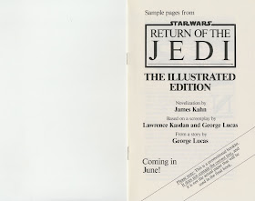
While the manuscript was being typeset, I was working on an eight-page sample booklet, for use at book fairs, to solicit orders; below are three pages.
Below is my layout, drawn in marker, for the title page. Photo-Lettering was the typography house I used. A photostat of the film logo was given to me but I chose not to use it.
In my file is a 30-year old, discolored diazo print of the title page type; it was one of two prints. The other print was cut apart used for paste-up on the mechanical.
Below are selected pages from the book.
 |
| Half-title page |
 |
| Full title page |
 |
| Page one did not use the ITC Galliard font. |
 |
| Chapter opener |
 |
| Text spread |
The Return of the Jedi Sketchbook featured artwork by Joe Johnston, Nilo Rodis-Jamero, Ralph McQuarrie and Norman Reynolds. The cover was designed by Ballantine’s art director, James Harris.
I used the Crillee fonts for the section and subject titles. ITC Kabel fonts were used for the text, folios and tabs. Again, I chose not to use the film logo. Below are selected pages from the book.
(Next post on Monday: Pratt Institute and the Golden Age of Comics)


I can't wait to read the book!
ReplyDelete