Monday, January 30, 2012

Creator: Martin K. Speckter

The fiftieth anniversary of the interrobang, a punctuation mark created by Martin K. Speckter, is this year. Speckter was born June 14, 1915, according to the Social Security Death Index. The 1930 U.S Federal Census recorded the Speckter family in Omaha, Nebraska at 2533 North 16 Street. They had emigrated, from Russia, in 1921. He was the oldest of two children born to Morris and Ida; his father owned a grocery store.

In the mid-1930s, Speckter was a staff reporter for the Omaha World-Herald (Nebraska). On July 28, 1943, the World-Herald reported his army discharge.
Sgt. Martin Speckter, son of Mr. and Mrs. Morris Speckter, 2533 1/2 North Sixteenth street, received an honorable discharge from the army last week following several weeks of hospitalization resulting from an ailment which seriously affected his sight.

He was assigned to the army’s recruiting office at Richmond, Va., for more than a year following his preliminary training. Before entering the army, Speckter was employed as a newspaper reporter for The World-Herald and the McCook Gazette….
His upcoming wedding was noted in the December 3, 1944, World Herald.
Announcement is made by Henry Bank of the approaching marriage of his daughter, Miss Virginia Bank, to Martin K. Speckter, son of Mr. and Mrs. M.J. Speckter, on December 14. Miss Bank is associated with the Douglas County Chapter of the American Red Cross.
The World-Herald noted his move to Miami on November 1, 1946.
Bozell & Jacobs, Omaha Advertising agency, has opened a branch office in Miami, Fla., it was announced Thursday.

Martin K. Speckter, former World-Herald staff member, will be manager of the office. He will be assisted by Edward N. Green, another Omahan. Both men were in Army public relations during the war.

Mr. Speckter will go to his new assignment from the agency’s Los Angeles office.
Eventually, Speckter moved to New York City, where he created the interrobang. Its creation, acceptance and use was reported in the World-Herald.

World-Herald, May 27, 1962

World-Herald, June 23, 1967

World-Herald, May 28, 1971

On October 13, 1968, the Bridgeport Post (Connecticut) reported on the Remington typewriter version of the interrobang and its designer, Kenneth Wright. William Zinsser wrote a negative review of the interrobang in Life magazine, November 15, 1968.


The Hamburg Sun (New York) published an article, on January 6, 1972, that identified Richard Isbell as the designer of the interrobang for American Type Founders' Americana fonts. Wright’s version was used in the article.


Allan Haley wrote about the interrobang in Typeworld, June 1980, and x-height, Volume 3, Number 1, 1994 (the article can be read online at Font Haus.)

Typeworld

X-Height, 1994

Speckter passed away February 14, 1988, according to the Social Security Death index; below is his February 16 obituary in the New York Times (the online version of the obituary does not have the interrobang).


Shady Characters has a two-part article on the interrobang; part 1and part 2. Images of Isbell's original art are at flickr; 1 and 2. An interview with Penny Speckter is here. The Freeborn Times celebrates "The Interrobang's Big 5-0." The BBC has a less than enthusiastic mention of the interrobang. A video on the interrobang is here.

Explained: Exclamation Point (The Interrobang makes an appearance.)


(Updated December 10, 2022. Next post on Wednesday: Michele Falanga, Frank Frazetta’s childhood art teacher)

Monday, January 23, 2012

Lettering: Dragon Tales


In 1974, I was a graphic design major at Arizona State University. One of the courses was Advanced Typography which was taught by Tom Hall, now at California State University, Long Beach. One of the assignments was a design with three-dimensional letterforms.


I chose Robert E. Howard's Conan novel, The Hour of the Dragon. The story was adapted by Roy Thomas, Gil Kane and John Buscema in Marvel Comic's Giant-Size Conan, issues one through four.

I do not have the sketches but I used the typeface Bradley.


I stacked the words to suggest the shape of a dragon, but it needed a finishing touch. I extended the lowercase “g” to create a “tail”. There were several versions before I settled on the one below.


The original lettering was penciled then inked on one-ply bristol board; the art measures 9 by 15.125 inches (22.86 by 38.4175 centimeters). I transferred the outline of the lettering onto a sheet of watercolor paper, which has a rough surface. Next, I glued the paper onto a sheet of one-inch styrofoam, then cut out the letters. The area around the title was watercolor paper (spray-painted red) which was glued onto quarter-inch styrofoam. Blue acetate was attached to the back of the quarter-inch sheet, then the styrofoam letters were adhered to the acetate.

There was a light bulb behind the title to illuminate the blue background. Two bulbs, one red and one white, were used on the front. Jesse Castellano, a photographer, took the pictures.


In 1987 the late Byron Preiss produced a science fiction series, Millennium, for the publisher Walker & Company. One of the titles was Chess with a Dragon by David Gerrold; it was illustrated by Daniel Torres. Byron said he wanted the Torres art to be small on the cover. Here was an opportunity to create a vertical title on the dust jacket. I ordered the type from Photo-Lettering. I cut apart the diazo print and adjusted the letter spacing and line spacing. Then I added the tail, from “The Hour of the Dragon”. I used adhesive rubylith to modify some of the letters.


Then I made a photostat of the type. A smaller version was used on the mechanical for the dust jacket.


Below is a detail of the dust jacket and the title page.


Back in 1974, shortly after The Hour of the Dragon, I made The Year of the Dragon but didn't do anything with it until December 2011, when I used it on my holiday greeting card. The first step was lettering on vellum. On the back of the vellum, graphite was added on the letter’s outline. The vellum, face up, was taped to a sheet of bristol board, then the outline was traced to transfer the lettering. The vellum was removed and the inking was done.


Today is the first day of the Lunar New Year.


(Updated September 6, 2012; next post on Monday: Martin K. Speckter, creator of the interrobang)

Friday, January 20, 2012

Creator: Phil Seuling


Business Card


1971 interview
2008 New York Comic Con panel

Born: January 20, 1934
Died: August 21, 1984


(Next post on Monday: How to recycle a dragon)

Monday, January 16, 2012

Anatomy of a Logo: Green Lantern


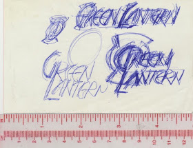
On December 22, 1993, DC Comics designer Curtis King called and asked if I had time to work on a Green Lantern logo. How could I say no? He faxed the cover art which had the new costume design and lantern emblem. He added that flames were part of the logo. The next day I began roughing out some designs.


In these thumbnail drawings I tried to integrate the lantern and the letters.


I dropped the lantern altogether in this logo.


Top design used an optical illusion. In the bottom design;
coloring (dots outline the lamp) and two rules define the lantern.


Most of the letter designs from the optical illusion drawing
were used in this perspective version.


I used the crossbar of the "T" for the bottom of the lantern.


In early January 1994, I faxed the design to Curtis. A few days later he said my designs were rejected. Ken Lopez's design was used on the series. Check out Todd Klein's five-part Green Lantern Logo Study for the logo's history: 1 2 3 4 5.

(Next post on Friday: Phil Seuling)

Monday, January 9, 2012

Anatomy of a Logo: The Green Lantern Corps


In late October 1985, DC Comics art director Richard Bruning called and asked to see my portfolio. The following day he looked at my work and offered the Green Lantern Corps logo to me. Richard showed some concepts with the words stacked in several arrangements and the lantern incorporated in various ways. He wanted to incorporate the lantern in the logo and left it up to me to come up with something.


Back at my studio, I reviewed the designs and sketched out a design with “Green Lantern” on one line. I saw the possibility of anchoring the “L” in the center of the lantern’s lamp. Most of the letters in the sketch had thick and thin strokes. The “R” had some problems that needed to be worked out. The letters’ rounded corners was a way to update the logo and set it apart from earlier versions. The lantern was drawn separately and used as a guide when the letters were added.


The first tight pencil rendering was close to the finished logo. Only the “G” and “L” had the thick and thin strokes; a crossbar was added to the “G”. The stroke width of the other letters was essentially the same.


After studying the logo, I decided to make it bolder. Several days later I met with Richard, who requested a few changes. The bottom stroke of the “L” was shortened so it aligned with the inside of the vertical stroke of the “A”. Being able to see that small segment of the circle between the “L” and “A” improved that part of the logo. Richard didn’t like how the top of the circle and “L” came together. So the “L” was extended a little above the circle. The leg of the “R” in Corps was adjusted in the finished logo.


At my studio, I positioned the tracing paper drawing on the light box. Then I peeled off the the top layer from a piece of LetraMax 2000 Mechanical Board and placed it over the tracing paper drawing and began work on the finished art. In the middle of November, I delivered my first DC-commissioned logo to Richard.


The Green Lantern Corps number 201 appeared in the Spring 1986.


The Green Lantern movie was released in June 2011. Right away I noticed the designer of the movie poster had positioned the Bank Gothic "L" in the lantern's lamp.


Related post: ...Green Lantern’s light!

(Next post on Monday: rejected Green Lantern logo designs)

Sunday, January 1, 2012

Street Scene: Happy New Year


N E W Y O R K C I T Y
166 Avenue A, Manhattan


(New post on Monday)