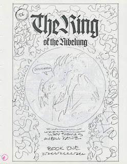
On August 3, 1989, I had a meeting at DC Comics with editor Andy Helfer and designer Curtis King to discuss a logo for the four-part mini-series, The Ring of the Nibelung, a graphic novel adaptation of Richard Wagner's opera by Roy Thomas and Gil Kane. In the title, “The Ring” was to be larger than “of the Nibelung”. We decided on blackletter for the logo and a circular design for the cover.
I few days later I received fax of the cover design, which had the diameter of the circle, positions of the DC bullet in the upper lefthand corner and the subtitle and credits. The squiggly lines represent background art.
I assembled six versions of the logo: four with the Wilhelm Klingspor Gotisch and Goudy Text fonts, and two with Bradley. These designs were faxed to Keith Wilson.
I assembled six versions of the logo: four with the Wilhelm Klingspor Gotisch and Goudy Text fonts, and two with Bradley. These designs were faxed to Keith Wilson.
On August 31, I faxed three designs to Keith.


