Will to Power was a twelve-issue limited series published by Dark Horse Comics. The editors were Jennie Bricker and Marilee Hord but I don’t recall which one called me, on February 16, 1994, about the logo. After a brief overview of the comic and the deadline, I received the fax of the logo designs produced by the in-house staff.
The next day I sketched out a few designs on scraps of craft paper.
A week earlier I had delivered the Jack of Hearts logo to Marvel, and I was working on the Great Grimmax logo for Defiant when I accepted the Dark Horse job. On February 19, I did a few thumbnail sketches.
I spent most of Monday morning, February 21, developing three designs. Two designs had some of the blockiness of faxed logos.
The main challenge was how to integrate the fist and lightning bolt with the title. On the third design I moved the fist and lightning bolt below POWER and combined the angles of the lightning bolt with the O and E.
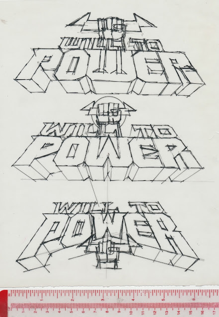
Next, I did the first of three stages of refining. Using a Rapidograph pen and tracing paper, I did slightly tighter versions of the sketches, then added red guidelines.
Detail of the top sketch.
Here is the second stage tracing...
…and the third tracing. The red bracket on the bottom logo meant that I should move TO slightly left to close the gap.
In the afternoon I made a photocopy and faxed it to Jennie or Marilee.
On Tuesday afternoon we discussed the designs. Number three was chosen and I was told to make the outline bolder. The next day I accepted two logos, Wraitheart and Mode Extreme, from Marvel. Starting on Thursday, I used a copier to enlarge the design then added guidelines.
The photocopy was taped to a light box and a sheet of LetraMax placed over it. The inking was done using a T-square, adjustable triangle, and a variety of ellipse templates. Corrections were made by scratching away ink. The logo measured 4.56 by 12.31 inches / 11.59 by 31.27 centimeters.
Friday afternoon I faxed the logo to Dark Horse and it was approved. The next day the finished art was sent by Federal Express.
Sometime later, I received copies of the first issue. The logo had been modified: a serif was added to the R, which, sort of, made the logo symmetrical. In the early stages of the design, I had considered adding that serif to the R, but in my mind it din’t look right, so it never made it in the sketches. In the logo, the right hand is holding the lightning bolt, but on Titan’s costume the left hand has it.
The remaining covers can be viewed at the Grand Comics Database.
(Next post on Monday: 1980s J.R.R. Tolkien Calendars)


I remember this book. It was kinda strange for a super book.
ReplyDeleteI loved this book
ReplyDelete