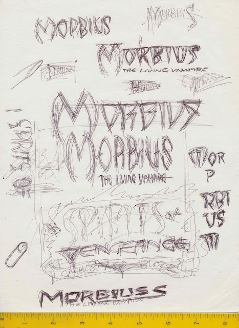
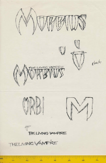
On August 19, 1991, Bobbie Chase called about logos for Morbius, Spirits of Vengeance, Darkhold, Nightstalkers, and Rise of the Midnight Sons.
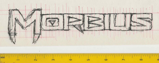
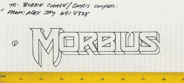
Here are the Morbius: The Living Vampire sketches I made on August 24.
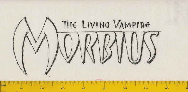
Two days later I started work on the logo designs.
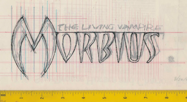
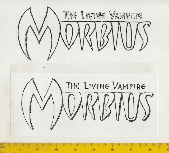
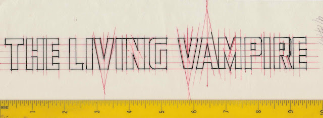
Vellum overlay with refined letterforms
Alternate letter R
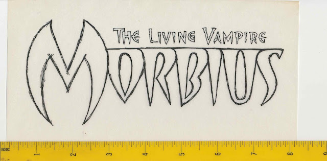
I finished three designs and faxed them to Bobbie.
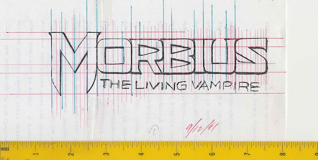
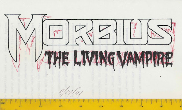
On August 28, Bobbie’s assistant, Chris Cooper, called with feedback on the logo they chose. I noted the revisions in red ink, “Deeper shadows, slightly taller letters”.
On September 12, I made the changes to the logo and added shadow effects.
Logo revisions were faxed September 14.
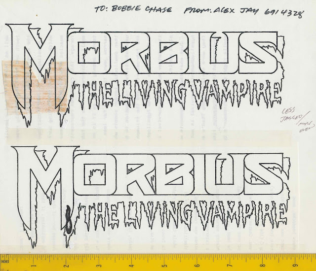
Feedback was noted in red. Instead of adding a drop of blood to one of the fangs, I rendered the drop shadow and subtitle as dripping blood.
The shadow effect was okayed but the letterforms were to be “less jagged/more even”. The block letters were used as a guide for the dripping letters.
The revised logo was faxed on September 17 and approved.
For the character name, Morbius, I enlarged it on a photocopy and refined the letterforms in red ink. The photocopy was placed on a lightbox then covered with a sheet of Letramax paper for inking.
The final art was delivered two days later.
Morbius: The Living Vampire comic book was part of The Rise of the Midnight Sons series. I believe the first appearance of the logo was in Ghost Rider #25 (below).
Morbius: The Living Vampire comic book debuted with a September 1992 cover date. The Living Vampire subtitle was not used on the first issue.
#2, October 1992
Morbius: The Living Vampire plastic fangs were given away at comics stores to promote the comic book.
Five issues of Morbius Revisited were published in 1993. I don’t know who lettered Revisited.
The Classic Marvel Figurine Collection #99, July 1, 2009, featured Morbius.
The cover and credits for Morbius: Bond of Blood #1, April 2021.
SIDEBAR: Film Adaptation
Columbia Pictures/Marvel Entertainment
Early September 2022 I saw the film on an airplane. Surprisingly, the open title sequence logo, by Antenna, was different. The film’s letterforms are similar to the comic book logo except the R and B.
The letter M was featured in the end title sequence.
Here is a side-by-side comparison of the original comic book art and movie Ms. On the movie version, the letter strokes are slightly thinner and the curve of the fangs starts higher and ends with a narrower point.
A rare instance of a film being mostly faithful to two different comic book logos for the same character!


