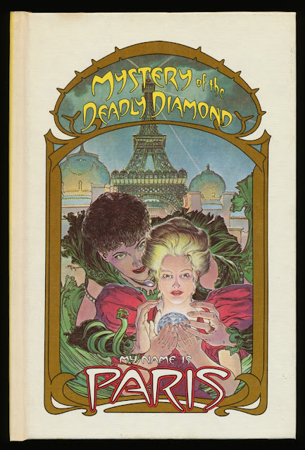
My Name Is Paris was a 1987 four-book mystery series produced by the late Byron Preiss. The stories were written by Elizabeth Howard and illustrated by Michael William Kaluta. The logo and titles were lettered by Tom Orzechowski.
Once Byron secured the author and illustrator, he had to find a publisher. He described the project to me and suggested a design direction for the covers: a wrap-around decorative border. Originally, the series title was “A Paris Mackenzie Mystery”. Below are photocopies (stitched together) of the cover with different borders and fonts.
Random House picked up the series. Discussions between Byron and the publisher resulted in the series being retitled “My Name Is Paris”, and the cover design was to emulate the Art Nouveau style. I referred to the Alphonse Mucha books in my library.
Preliminary sketch
Tracing paper placed over the sketch and the design developed a bit.
The same steps as above.
Alternate symmetrical designs
Some asymmetrical design sketches
Roughs for the back cover design
These four designs were submitted but none were chosen.
At the time I had a heavy workload. I suggested Tom Orzechowski handle the lettering and border design, and Byron agreed. I shared my sketches with Tom and told him to come up with his own design. Tom used a number of lettering books for reference.
Photocopy of Tom’s first border design.
Photocopy of preliminary title and logo lettering
Photocopy of revised border design with lettering
Photocopy of Tom’s sketch with revised border
Tom’s note to me
Photocopy of two titles on an arc
Photocopy of another border revision before the the final version
The border was symmetrical so I told Tom to draw half of it. A film positive was made of the art. The film was flopped and the two halves joined together. A photostat was made of the complete border. After 25 years the film has yellowed.
The titles and logo were positioned on an acetate overlay then a photostat was made of it for the mechanical. Below, the acetate shrank near the top, with flares visible on the ripples.
The Random House mass market paperback covers of books one, Mystery of the Metro; two, Mystery of the Magician; three, A Scent of Murder; and four, Mystery of the Deadly Diamond.
Two German mass market paperback covers, 1988
Title page design
Photocopy of revised title page design with the border from the cover.
The logo was repositioned and placed on an acetate overlay.
A photostat was made for the mechanical. ITC Berkeley was used for the title, credits and publisher. Below, the printed title page from the first book.
(Tomorrow: Part 2, Michael Wm. Kaluta’s interior art)


