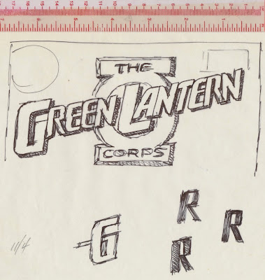
In late October 1985, DC Comics art director Richard Bruning called and asked to see my portfolio. The following day he looked at my work and offered the Green Lantern Corps logo to me. Richard showed some concepts with the words stacked in several arrangements and the lantern incorporated in various ways. He wanted to incorporate the lantern in the logo and left it up to me to come up with something.


Back at my studio, I reviewed the designs and sketched out a design with “Green Lantern” on one line. I saw the possibility of anchoring the “L” in the center of the lantern’s lamp. Most of the letters in the sketch had thick and thin strokes. The “R” had some problems that needed to be worked out. The letters’ rounded corners was a way to update the logo and set it apart from earlier versions. The lantern was drawn separately and used as a guide when the letters were added.
The first tight pencil rendering was close to the finished logo. Only the “G” and “L” had the thick and thin strokes; a crossbar was added to the “G”. The stroke width of the other letters was essentially the same.
After studying the logo, I decided to make it bolder. Several days later I met with Richard, who requested a few changes. The bottom stroke of the “L” was shortened so it aligned with the inside of the vertical stroke of the “A”. Being able to see that small segment of the circle between the “L” and “A” improved that part of the logo. Richard didn’t like how the top of the circle and “L” came together. So the “L” was extended a little above the circle. The leg of the “R” in Corps was adjusted in the finished logo.
At my studio, I positioned the tracing paper drawing on the light box. Then I peeled off the the top layer from a piece of LetraMax 2000 Mechanical Board and placed it over the tracing paper drawing and began work on the finished art. In the middle of November, I delivered my first DC-commissioned logo to Richard.
The Green Lantern Corps number 201 appeared in the Spring 1986.
The Green Lantern movie was released in June 2011. Right away I noticed the designer of the movie poster had positioned the Bank Gothic "L" in the lantern's lamp.


Hi Alex,
ReplyDeleteI like all the stuff you've been posting, but I'd be very interested to see some more recent work of yours on the blog too!
Thanks,
David
I like all the stuff that you post.
ReplyDeleteNice Poster
ReplyDelete