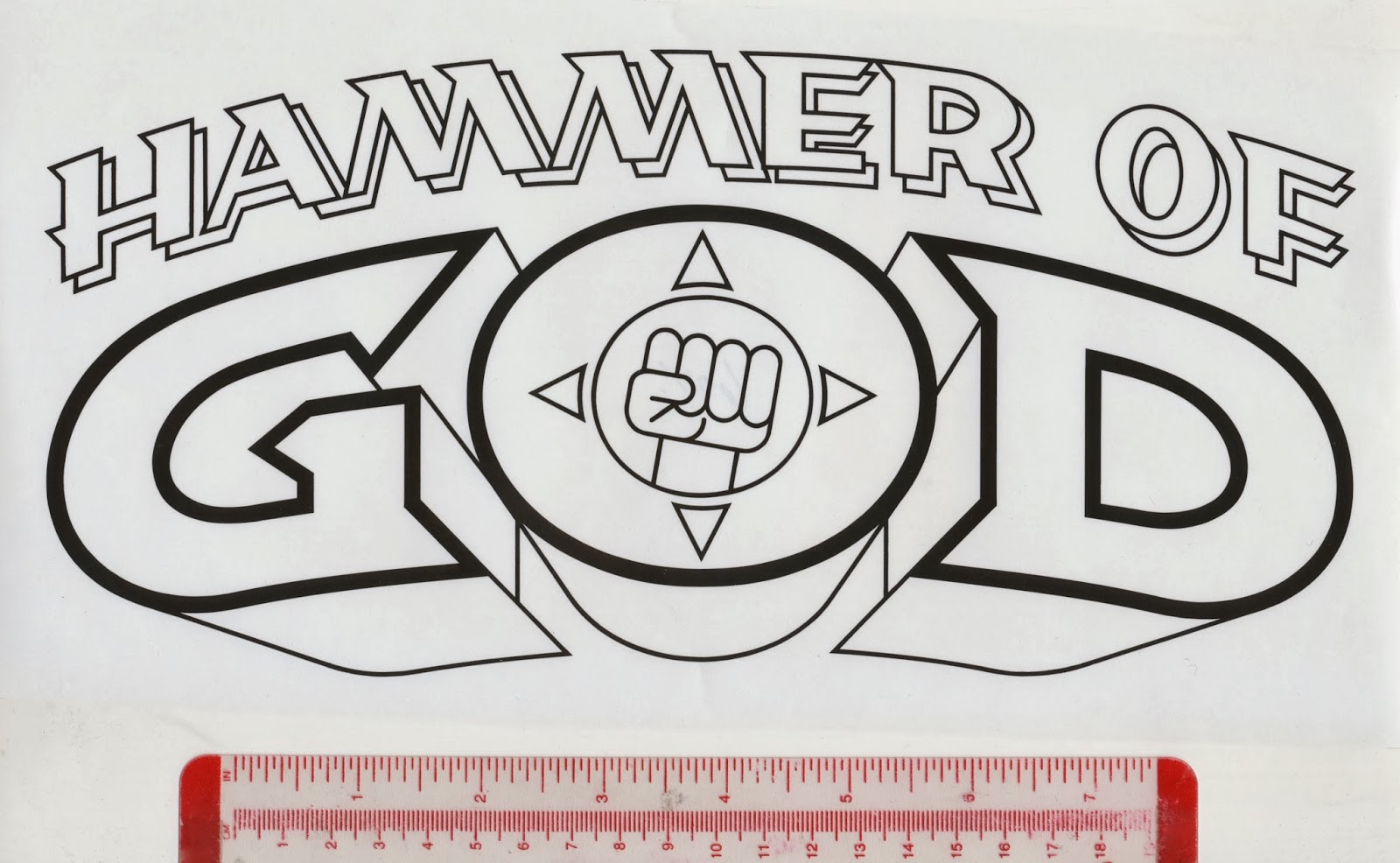
In the second week of November 1992, Dark Horse editor, Anina Bennett, called and offered two logos to me: Hammer of God and Mezz. My first job for them. (They were followed by Will to Power and Barb Wire.) I said I was interested and waited for her package.
Anina’s package included photocopies of a few finished pages, some penciled pages and the covers published by First. Her cover letter, dated November 16, 1992, described the characters and shared her thoughts on the logo.
First, 1991
I made a number of sketches in a sketchbook and enlarged them on a photocopier. I chose to emphasize GOD by making it larger than the other words. The raised fist was treated as ornaments in some designs. It was an easy decision to use the raised fist emblem in place of the O in GOD. Guidelines were drawn over the sketches.
The G and D designed to be mirror images of each other.
Tracing paper was placed over the photocopies
to make the first refinements.
to make the first refinements.
Second refinements were made and faxed on November 30.
Anina selected the third design. I drew guidelines
on the photocopy then placed tracing paper over it.
Some of the letters were modified and the spacing adjusted.
The raised fist was moved inside the O.
The raised fist was moved inside the O.
The revised logo was photocopied and faxed to Anina.
Anina approved the design. I enlarged it about one-and-a-half times and drew guidelines for the arc, the weight of the outline, the shape of the letters, shadows, and raised fist, which was tilted slightly. The photocopy was positioned on a light box, then a sheet of LetraMax was placed over it. The inking was done with Rapidograph pens and an assortment of ellipse templates, an adjustable triangle and a flexible French curve.
A same-size photostat was made of the original art for my files.
The comic books were published in 1994.
Pentathlon designed by Dark Horse.
Butch and the fists designed by Dark Horse.
(Next post on Monday: Mezz Galactic Tour 2493)


No comments:
Post a Comment