SUNDAY, JUNE 26, 1983
I begin work late in the morning. From the pencil rendering I make a marker comprehensive (comp) of the logo before starting the finished art. I get a good sense of the line weight for the letters and beveled edges.

After examining the comp I see the need for minor adjustments. I place tracing paper over the comp and make a couple of notations in red.

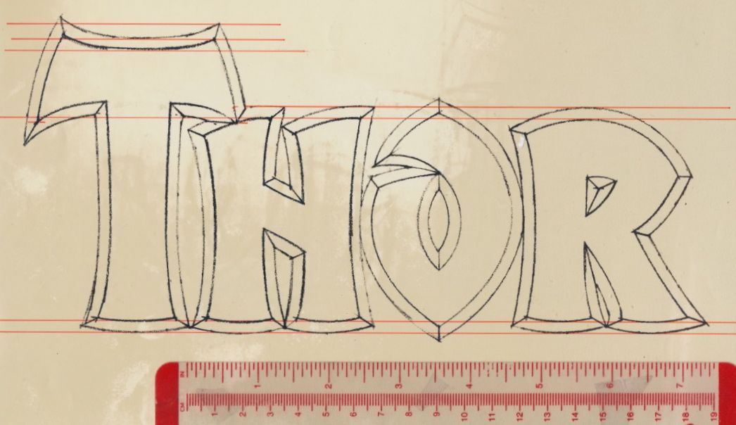
I make a photostat of the pencil rendering; it is made at 150 percent of the original. I use a T-square to square-up the photostat on the lightbox, then I tape it down. On top of the photostat I secure a sheet of LetraMax paper. I begin penciling the logo using a variety of French curves and ellipse templates. The inking is done with Rapid-o-graph technical pens. I correct inking errors either by scratching away the ink or covering it with white gouache.
I finish in the early evening. I mount the "Thor" LetraMax sheet on illustration board, then add a flap of heavyweight paper to protect the art. "The Mighty" was drawn separately and slightly larger than the space alotted. I make a photostat of "The Mighty" then affix it to the "Thor" art.


MONDAY, JUNE 27, 1983
Walt arrives at my studio to pick up the logo and deliver it to Marvel.
SEPTEMBER 1983
The Mighty Thor logo debuts on issue 338. When Walt picked up the logo, I was kidding when I told him I wanted to see my credit in large letters. Well, there it is on the letters page.


Walt and me at the 2007 Big Apple Con in New York City.

This is really great. Thank you for sharing!
ReplyDeleteAlex, I'd like to contact you privately to publish this tutorial on how you did this iconic logo in my mag. Please, write me to ferrandelgado at gmail dot com. Thanks!
ReplyDelete