The movie Ghost Rider: Spirit of Vengeance opens February 17. The title is based on the comic bookSpirits of Vengeance: Ghost Rider / Blaze, published by Marvel Comics. Bobbie Chase was the editor of the comic and related titles. Spirits of Vengeance #1 was part two of "Rise of the Midnight Sons" a six-part crossover with these titles: Ghost Rider #28, Part 1; Morbius #1, Part 3; Darkhold #1, Part 4; Nightstalkers#1, Part 5; and Ghost Rider #31, Part 6. I was designed with the crossover title, Rise of the Midnight Sons, and the logos except for Ghost Rider.
On August 19, 1991, I met with Bobbie and she offered the logos to me. On September 6, my initial Spirits of Vengeance designs were rejected. Bobbie suggested a more fluid approach, like brushstrokes.


On September 15, I used a crayon pencil to rough out "Ghost Rider/Blaze" and "Spirits of Vengeance".


Then I used a felt-tip marker to draw the letters.
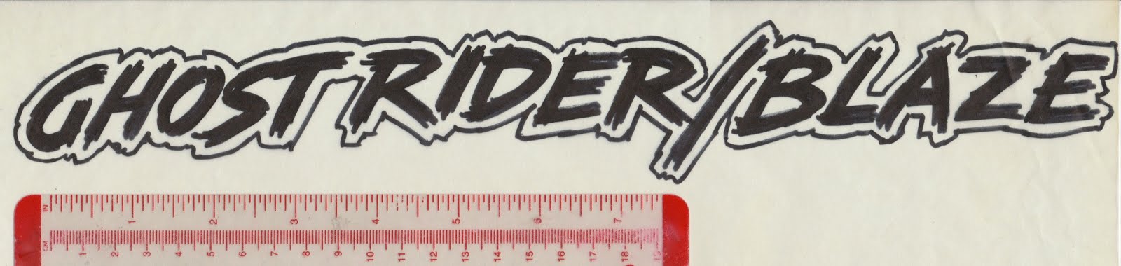

An outline version was made.

I combined the two groups into the logo. On September 16, I faxed the revised logo to Bobbie and she approved it.

About a week later, I enlarged the photocopy then added some guide lines. The photocopy was taped to a light box and a sheet of LetraMax 2000 was placed on top of it.

I used a variety of Rapidograph pens to ink the letters. Also used were a french curve and ellipse guides. The flames and outline were inked freehand. The finished art was delivered September 23.
 |
| Logo measures 7.875 by 14.5 inches / 20 by 36.8 centimeters |
The comic book was released in Spring 1992. What I saw wasn't the logo I had drawn. A decision was made to redo my logo so it resembled the the Ghost Rider logo. The basic design of my logo was used, but the "S" was widen and its top stroke enlarged and extended so "Ghost Rider & Blaze" could fit inside. Then "of" was reduced and the vertical stroke of the "F" was separated from the vertical stroke of the "N". Despite the changes, the logo worked very well.

Spirits of Vengeance.
ReplyDeleteNice Font style
ReplyDeleteThis version of the logo was in fact used to promote the series:
ReplyDeletehttps://2.bp.blogspot.com/-IwASkelPCY4/VtVPW3413hI/AAAAAAAAOlk/ScezsYS3Xwg/s1600-Ic42/RCO048.jpg
https://berkeleyplaceblog.com/wp-content/uploads/2020/07/IMG_9189.jpeg
Delete