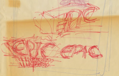
Epic Illustrated was a magazine published by Marvel in 1980. I don't have any calendar records on this assignment so I will try to reconstruct how my logo came to be in 1979.
It was in late August 1979 when Jim Salicrup called me (this was when I had a room at Continuity Associates). He asked me to develop some logo designs for Epic Illustrated. I don't recall if he described what the magazine was about. Prior to this, I did the Caleb Hammer logo which was published in Marvel Premiere, number 54; Salicrup was the editor. That particular job was a referral from Tom Orzechowski, but that's a story for a later time.
On August 25 I began making thumbnail sketches on the back of old Continuity Associates flyers (8.5 by 11 inches / 21.6 by 28 centimeters), and sheets of tracing paper.

Two sketches on the far right would be developed.

No sketches were developed.
From these sketches I refined four designs which will be examined, one at a time, over the next four days.
(Tomorrow: Part 2 of 5)


Good try of practice.
ReplyDeleteGood
ReplyDeleteNice breakdown on the “Anatomy of a Logo” — the way the process of sketching, refinement and form-finding is laid out really gives insight into how much work goes into a strong mark. For those building a brand, exploring logo design services in Hyderabad is a smart step to ensure your logo is distinctive, well-crafted and aligned with your identity.
ReplyDelete