Showing posts with label Graphic Design Workshop. Show all posts

Monday, April 6, 2020

School Days: W.C. Fields Shorts

At Arizona State University I was enrolled in Vanessa Vargo’s illustration class which was at 7:40 in the morning. For one of the assignments I created a poster promoting short films starring W.C. Fields. The “W.C. Fields Shorts” program was scheduled at the Memorial Union (MU) Movie House for October. The assignment called for the poster to be 18 by 24 inches (45.7 x 61 centimeters) and printed in two colors. 

I don’t have the thumbnail sketches but the concept was based on showing Fields in boxer shorts. Below are the top hat, headless Fields figure and lettering drawn on vellum. The lettering was based on the Koloss typeface in the Letraset catalog. (The alphabet can be viewed here.) Graphite was rubbed on the reverse side of the vellum then the top hat and lettering were transferred to illustration board and inked. Letratone was adhered over the lettering and parts of the hat. Four dancing figures, wearing different patterned orange shorts, were rendered in ink and gouache. Pantone paper was used for the background. The first version had an orange background. The second version used brown which made the orange shorts pop out.


I entered the poster in the Department of Art’s 1976 Annual Art Student Exhibition which was jurored by Misch Kohn.


Catalog design by Leon Dunn, ASU Graphic Design Workshop
Cover photography by Chris Hornung
Typeface: ITC Tiffany
Dimensions: 7.0625 x 7.4375 inches / 18 x 18.9 centimeters


(Next post on Monday: Casa Grande Neon Sign Park)

Monday, December 2, 2019

School Days: 7th Annual Hayden’s Ferry Poster

The Hayden’s Ferry annual festival poster (below) was created in the Fall 1976 term at Arizona State University’s Graphic Design Workshop which was headed by instructors Tom Hall and Ray Varnbuhler. Detailed information about the workshop and samples of printed matter are here. A history of the Mill Avenue Merchants Association’s (MAMA) festival is here. 

Tom Hall assigned the poster project to me. The poster specifications were 19 x 24 inches and printed in two colors. 

Below is a the first concept sketch which was rendered in markers. The image area measured 10.5 by 14 inches. The logo lettering was based on the wood type fonts French Clarendon and Egyptian Ornamented from the book, Wood Type Alphabets: 100 Fonts (1977). The illustration was a street scene filled with people and Mill Avenue storefronts. In the sky was the sun. At the bottom was a panel for the names of the merchants.


In the second concept the logo was loosely based on the font Cheltenham. Below it was a ribbon to be filled with information about the fair. The illustration showed more detail of the street scene plus the addition of a hot-air balloon. The bottom panel had a rendering of the type treatment for MAMA. The image measured 19 by 24 inches.


These two concept sketches were presented at a regularly scheduled class where progress reports were made by workshop members on their assignments. I stated my preference for the second concept. And I asked for help with the illustration. Dave Redding volunteered.

The logo lettering artwork measured
5.0625 by 17 inches. A transfer type (whose name I don’t recall) was used on the ribbon for “ARTS & CRAFTS FAIR” and “DEC. 3 • 4 • 5 10 AM–DUSK”.


A photostat was made of the logo and pasted on the back of the original art which was inadvertently trimmed. (The image area is 4.1875 by 14.5 inches.) The Cooper Black font was used for “7TH ANNUAL” and pasted to the ribbon (below).


At some point MAMA representatives approved the design and the poster went into production. The lettering, illustration and type were pasted on a large board which was known, in the trade, as a mechanical. An overlay gave color instructions to the printer. Black and orange inks were used on the goldenrod paper stock. I don’t recall the printer but it was done locally, possibly at Temple Daily News or Little Wonder Press.


Fonts from the ITC Korinna family were used for the bottom panel.

Detail of poster credits

My logo continued to be used at subsequent fairs. Below are a belt buckle (2.25 by 3.75 inches; purchased on eBay) from the 1978 fair; t-shirts from 1977 and 1980; and 10th anniversary Frisbee from 1979.


 Related Post
Homage to the Bag


(Next post on Monday: Julian Waters)

Monday, March 25, 2013

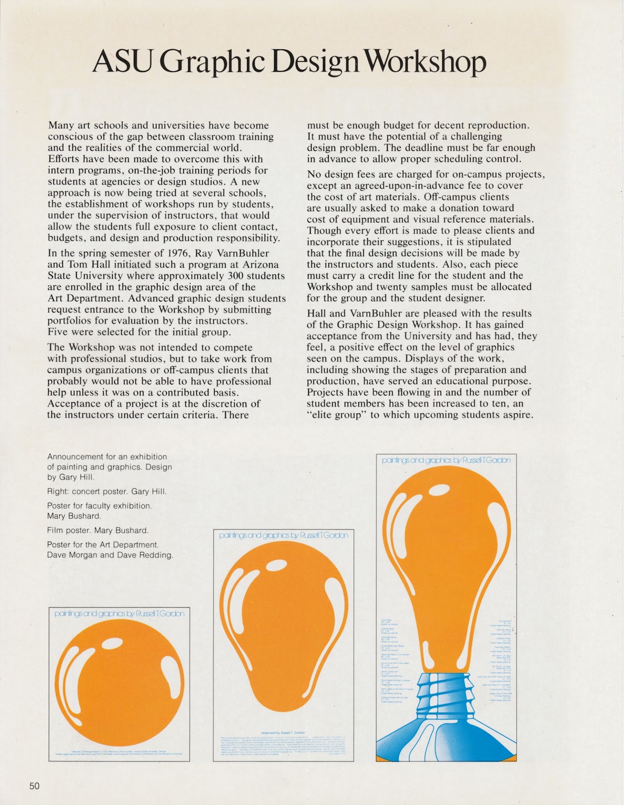
School Days: ASU Graphic Design Workshop


The Graphic Design Workshop, at Arizona State University, was organized by Tom Hall and Ray VarnBuhler. The photo (below) is of some of the students in the first two workshops. Front row, left to right: Dave Redding, Alex Jay, Jo Litton. Back row, left to right: David Morgan, Chip Kettering, Francisco Zuniga, Mary Bushard, Maryann Leake, Greg Pentowski, Gary Hill, and Tom Hall.


The program was featured in the design magazines Communication Arts, May-June 1977, and Print, November/December 1978.


 Clockwise, top left: Gary Hill; Mary Bushard;
Dave Morgan and Dave Redding; Mary Bushard

 Clockwise, top left: Maryann Leake; Chip
Kettering; Dave Redding; Leon Dunn

Top, left to right: Dona Nelson, Jean Wong, Juliana Packer (behind),
Christy Fankhuser, instructors Tom Hall and Ray VarnBuhler, Brian
Lovell, Dale Campbell, Sheryl Lieb and Tom Chung; bottom: Gary Hill

Top and bottom right: Peter Fasolino; bottom left: Kathy Dickinson

Top: Marta Zensen; bottom: Sue Redding

Top: Maryann Leake; bottom: Chip Kettering

Scotteee Lesh

Top: Dave Morgan and Dave Redding; bottom: Mary Bushard and Gary Hill

Top: Scotteee Lesh; bottom: Peter Fasolino

Top: Chip Kettering; bottom: Dave Morgan


Liz Powell

Below are some workshop projects I produced.

Cleo Laine / John Dankworth


Northlight Gallery Calendar


Mailing Panel

Photo exhibition


Hayden’s Ferry, 1976


Homage to the Bag