Monday, November 28, 2011

Lettering: Muppet Movie Poster Parodies


Muppet-Vision 3D is located at Disney's Hollywood Studios in Orlando, Florida. The attraction opened on May 16, 1991. Movie poster parodies, featuring the Muppets, line the wall of the entrance waiting area. I did the title lettering for two posters.


TUESDAY, MAY 14, 1991

In the late afternoon, David Vogler, of David Kaestle Inc., calls and offers a rush lettering job for two Muppet movie posters, parodies of The Bride of Frankenstein and Follow the Fleet. The job is due in two days. I accept. He faxes layouts of the lettering and posters. (The faxes are missing from my file.) I begin work right away on the parody, Follow the Feet. About an hour later, I fax a tight comp of the lettering to David and he approves it. I leave the studio to see a performance by the Pan Asian Repertory Theatre.


WEDNESDAY, MAY 15, 1991

In the morning I begin lettering Follow the Feet. Most of the letters are straight lines, so the inking goes quickly. I use a compass to make the "O".


Above, the original art (9.75 by 4.8125 inches / 24.77 by 12.22 centimeters).
Below, an Amberlith overlay on top of the art.


The Bride of Froggen-Schwein lettering is made using a watercolor brush, India ink and newsprint. Unfortunately, I do not have the original art to show. With the brush filled with ink, I write the words on newsprint, which is porous and creates rough-edged letters. I write alternate versions for some words and individual letters. For example, when I wrote Bride, the "R" and "D" may have been poorly made. In that case, I replace the letters with another version. Sometimes the space between letters needs to be adjusted, so I cut the letters apart.

When all the words have been finished and positioned properly, I make a positive photostat of the lettering; a positive photostat will produce a black image on a white background. I examine the photostat and remove any blemishes, then I enhance the brushstroke streaks where needed.

Next, I make a negative photostat of the corrected photostat. Now the letters are white on a black background. I use white gouache and begin painting around the words to create the outline and shadow. When that step is finished, I make a positive photostat of the lettering. The photostat is affixed to illustration board and then a flap is added.


Above, the reproduction art (13 by 5.5 inches / 33 by 14 centimeters).
Below, art with an Amberlith overlay.


THURSDAY, MAY 16, 1991

I deliver the artwork in the early afternoon. David sends the artwork to a graphics facility to make color transfers of the lettering. The color transfer will be applied directly on a photograph; then the photograph will be photographed and printed in a large format.

Photos of my posters were taken in 2007. Some of the other Muppet movie posters can be viewed at Muppet Wiki.


(Next Monday: Anatomy of a Logo)

Monday, November 21, 2011

Street Scene: Klaus Nordling Slept Here


N E W Y O R K C I T Y

Klaus Nordling was born in Pori, Finland on May 29, 1910, and his family arrived in New York City on September 3, 1912. He grew up in Brooklyn. Nordling's father was a self-employed photographer according to his World War I draft card. They lived at 4213 8th Avenue in Brooklyn; the 1920 census had the same address.


This neighborhood was once part of Bay Ridge, known for its large Scandinavian population. Today, this location is part of Sunset Park which is also known as the Brooklyn Chinatown. In the early 1980s, Cantonese-speaking Chinese moved here, along 8th Avenue, where it was not as expensive and crowded as the Manhattan Chinatown, and the N line subway service was convenient and quick. From the Brooklyn 8 Avenue station to the Manhattan Canal Street (Chinatown) station is less than 25 minutes. The recent influx of Chinese immigrants are from the Fujian Province. The businesses along 8th Avenue, from 39th to 65th Streets, are predominately Chinese, but there are a few Hispanic and Polish establishments, and one pizzeria on this avenue.

In the 1930 census, the Nordlings had moved, a short distance, to 4015 7th Avenue (below).


According to the 1940 census, Nordling, his wife, Tel and daughter, Thea, lived at 760 67th Street (below). 


I profiled Nordling at the comic strip blog the Stripper's Guide, where you can see samples of his comic strip Baron Munchausen. After looking at the strips, scroll down to the comments to read my two-part mini-profile. You can read more about Nordling in Amerikansuomalaisia sarjakuvataiteilijoitam, from pages 130 to 136.

(Updated July 24, 2012; next Monday: The Muppets)

Friday, November 18, 2011

Anatomy of a Logo: Epic Illustrated, Part 5


For this logo I managed to integrate both words plus the issue date and price. I combined an uppercase "E" with lowercase letters; they're the same x-height. I chose not to dot the "i". Two mock-ups used a large logo while the third mock-up had an understated logo because of the art. Colored paper was used for the logos, with the other information painted in gouache. I was satisfied how the logo turned out.


Art by Mike Hinge


I think it was in mid-September when I delivered the logo designs to Jim Salicrup at Marvel. He disappeared with the material while I waited in the reception room. About ten minutes he reappeared and said, "Sorry."

Sometime later I heard or read that Archie Goodwin designed the logo. He was the editor of Epic Illustrated, so that's plausible. Maybe someone out there knows who did the logo. Years later I designed logos for Epic Comics.

(Next post on Monday: Klaus Nordling)

Thursday, November 17, 2011

Anatomy of a Logo: Epic Illustrated, Part 4


This symmetrical logo is more fantasy oriented; maybe gothic is the right word. The letterforms were influenced by the font Serif Gothic Black. I think the logo works very well with Frazetta art.


(Tomorrow: Part 5 of 5)

Wednesday, November 16, 2011

Anatomy of a Logo: Epic Illustrated, Part 3


Lightning bolts were used to balance the logo. The first sketch showed how "Illustrated" would have been positioned. Maybe this design suggests science fiction more than fantasy.


Art by Howard Chaykin; from The Stars My Destination


(Tomorrow: Part 4 of 5)

Tuesday, November 15, 2011

Anatomy of a Logo: Epic Illustrated, Part 2


Two of the logos I developed were symmetrical. This one used two-point perspective. The sans serif letters were bold, plain and easy to read. The word "Illustrated" could have been positioned in the rule or just below it. Maybe the logo is a bit neutral, meaning that it doesn't evoke science fiction or fantasy.


In early September I made cover mock-ups by using pages from Heavy Metal magazines. Colored paper was used for the logos. On the back of the third tracing paper sheet, you can see that I used the side of a pencil tip to rub graphite over the perspective lines. Then I turned the sheet over and transferred the lines to the mock-up and inked it.


Art by Alex Nino


(Tomorrow: Part 3 of 5)

Monday, November 14, 2011

Anatomy of a Logo: Epic Illustrated, Part 1


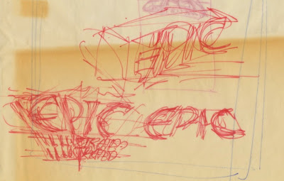
Epic Illustrated was a magazine published by Marvel in 1980. I don't have any calendar records on this assignment so I will try to reconstruct how my logo came to be in 1979.

It was in late August 1979 when Jim Salicrup called me (this was when I had a room at Continuity Associates). He asked me to develop some logo designs for Epic Illustrated. I don't recall if he described what the magazine was about. Prior to this, I did the Caleb Hammer logo which was published in Marvel Premiere, number 54; Salicrup was the editor. That particular job was a referral from Tom Orzechowski, but that's a story for a later time.

On August 25 I began making thumbnail sketches on the back of old Continuity Associates flyers (8.5 by 11 inches / 21.6 by 28 centimeters), and sheets of tracing paper.


Two sketches on the far right would be developed.


No sketches were developed.


Three sketches at the top would be developed.


These sketches would be developed.


The bottom two sketches would be developed.


The bottom left sketch would be developed.


No sketches were developed.


From these sketches I refined four designs which will be examined, one at a time, over the next four days.


(Tomorrow: Part 2 of 5)

Monday, November 7, 2011

Street Scene: Super Heros Librairie


• PARIS •
175 Rue St. Martin, near the Centre Georges Pompidou


(Next post on Monday: "Anatomy of a Logo: Epic Illustrated")