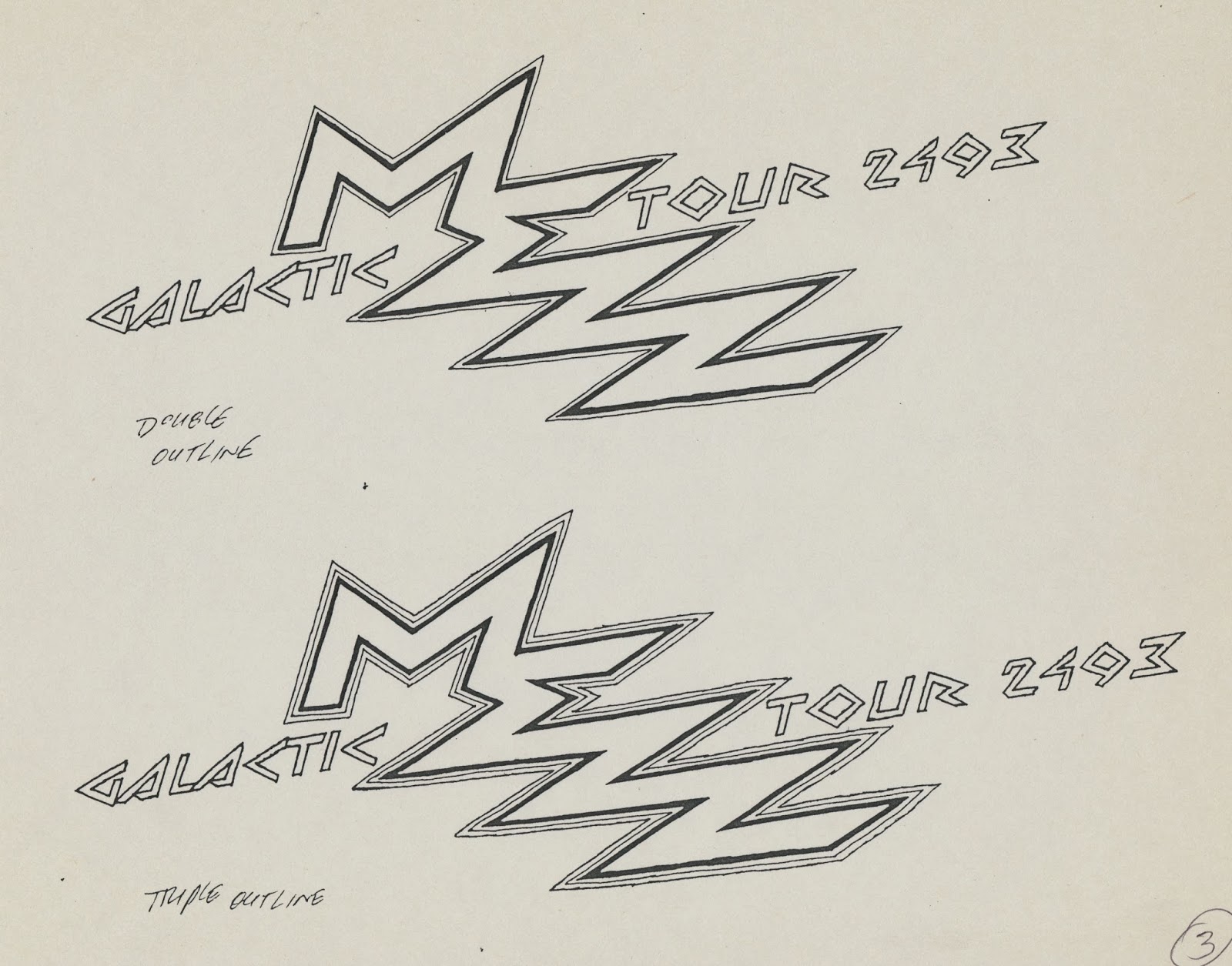
In the second week of November 1992, Dark Horse editor, Anina Bennett, called and offered two logos to me: Hammer of God (shown last week) and Mezz. (They were followed by Will to Power and Barb Wire.) I said I was interested and waited for her package.
Anina’s package included photocopies of a few finished pages, some penciled pages. Her cover letter, dated November 16, 1992, described the book’s concept.
Anina’s package included photocopies of a few finished pages, some penciled pages. Her cover letter, dated November 16, 1992, described the book’s concept.
Thumbnail sketches
Thumbnail designs
Preparing to develop the top design
Refining the design and adding effects
Photocopy enlargement of thumbnail design
and preparation to develop it
and preparation to develop it
Tracing paper overlay
Refining the design
Various effects
Photocopy enlargement of design
and preparation to develop it
A single letterform for M and E. Optically,
the M looks shorter than the E and Z.
Subtitle in a square grid
Various effects and alternate arrangement of subtitle
Anina selected sketch 1A.
Spacing adjusted between letters and words of subtitle
A same-size photostat was made of the original art for my
files. Below is a scan of the stitched-together photostat.
files. Below is a scan of the stitched-together photostat.
Mezz, scheduled for 1993, takes place 500 years in the future. Mezz was delayed a year, so someone at Dark Horse adjusted the subtitle’s year to 2494. The comic book cover had a May 1994 date.
(Next post on Monday: Transportation Building)


No comments:
Post a Comment