Showing posts with label Robbin Brosterman. Show all posts

Monday, June 22, 2015

Anatomy of a Logo: The Question


The Question logo was commissioned by Robbin Brosterman, a designer at DC Comics, who said a book, compiling the 1987 to 1990 comic books by Dennis O’Neil and Denys Cowan, was going to be published. During our meeting, Robbin suggested using a brushstroke or brush lettering.

I started rough designs on October 1, 1991. One idea was placing the title inside a brushstroke. Another sketch had the question mark in the letter O, and one had part of the question mark as the tail of the Q.


On sheets of newsprint, I used a brush to write out the title. I used newsprint because the ink dries quickly. I’ve reconstructed, as much as possible, the five sheets of newsprint which had been cut up to create the final logo art.

I did a number of circular warm-up strokes. I changed the angle of the tip to make the strokes rough and streaky rather than solid. On the sheet below, the title with the Post-it Note is composed of several pieces of lettering.


On this sheet, I cut out and used the O, part of the N, and tail of a Q. It wasn’t necessary to write Question as a whole word.


“The” was lettered horizontally and vertically. I also lettered the Q without a tail which was drawn separately and added later. 


Here I tried a rectangular Q. The amount of ink in the brush affects the roughness and streakiness of the stroke.


From this sheet part of the E was used elsewhere.


After about fifteen minutes, I stopped lettering and began assembling the logo by combining the letters and parts of brushstrokes.


The following photographs of the above samples show how the various pieces were fitted together. The Q was in three pieces; the E had two parts; TION was repositioned; and a different N was used.


A Q from another sheet was used with the rest of the lettering.


This scan shows the size and scale of the lettering. The vertical versions of THE were lettered as a single units without adding any pieces. 


Here was how all the pieces, for this logo, were put together.


I faxed these four designs to Robbin. She also liked design number four over the others and suggested some adjustments to the Q and O.


I made photostats of the O then added a new tail to make the Q. Post-it Notes were very handy substitutes for white paint.


I didn’t turn in the newsprint artwork because it was too fragile. Over time the newsprint would have turned brown and brittle. I submitted a photostat of the lettering as final art. I made another change to the logo by moving up the O and N.


Months later, I found out from Robbin that The Question book had been cancelled because of insufficient orders from the comics stores. So, my logo was never used. 

(Next post on Monday: British Printing Ink Advertisements)

Monday, October 22, 2012

Anatomy of a Logo: Ironwolf


Around 10 o’clock in the morning on March 23, 1992, DC designer Robbin Brosterman called and offered the Ironwolf graphic novel logo to me. I accepted. The next day a two-page fax arrived. The first page was her cover layout and the second was an ad for the book with an Ironwolf logo by Todd Klein from 1987. (The book collected the three Ironwolf stories from the 1972 Weird Worlds issues 8, 9, and 10.) I called Robbin and we discussed the logo design. She wanted the logo to match the width of the box for the art. The lettering should be tall and condensed, and perhaps similar to black letter or with elements from Klein’s logo. On the fax, I made a note that sketches were due April 3.


On March 31, I began work on the logo. For one design I used Gothic Tuscan Pointed from Rob Roy Kelly’s 100 Wood Type Alphabets published by Dover. In place of the “W” I inverted the letter “M”, so almost all the vertical strokes were parallel. 


On tracing paper, I outlined the Gothic Tuscan font without the points on the baseline. The second sketch used the pointed elements of the logo in the ad. On the bottom sketch I stripped away most of the serifs and made the letters angular. Then I refined the sketches.


On April 2, a photocopy of the designs were faxed to Robbin. She called back and wanted to use design number two with some modifications: taller letters, new design for the “I” and more space at the top angled stroke of the “W”.


Later that day I made two photocopies of the design. I trimmed one of them and pasted it over the other; you can see where by the yellow rubber cement stains. I changed the ”I” and adjusted the height of the strokes in the “R” and “F”.


This design was faxed to Robbin and she approved it.


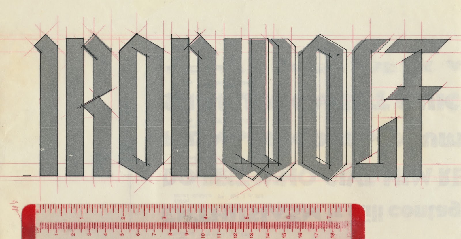
On April 9, I enlarged the design and carefully measured the the width and angle of the letter strokes in red.


I placed tracing paper over it and made more modifications. The width of the logo was constant with a significant change to the design of the “W”, minor changes to the “O”, “L”, and letterspacing adjustments.


I positioned the tracing on a light box then a sheet of LetraMax was placed over it. The inking was quick and easy.


Ironwolf: Fires of the Revolution was published August 1992. Robbin did a superb book and jacket design. The paperback edition was released April 1993.


At this year’s New York Comic Con, I saw Howard and returned some artwork I had misplaced. On the topic of digital tablets and smartphones he doesn’t care for them as a way to read comics. He said he’s a “page layout guy” and these digital devices obviate his skillset. A couple of days later, I recalled Norma Desmond’s line, “I am big, it’s the pictures that got small!”, from Sunset Boulevard: “Comics are big. It’s the screen that got small.” Of course, you could substitute movies, magazines, etc. for comics.


(Next post Saturday: Ed Benguiat)