Tuesday, September 27, 2011

Creator: Larry Hama


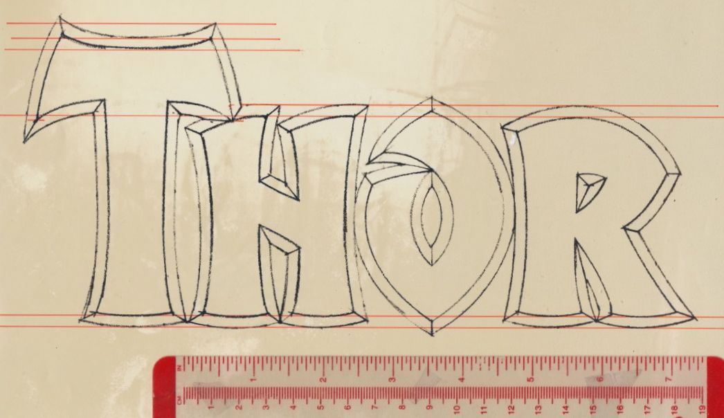
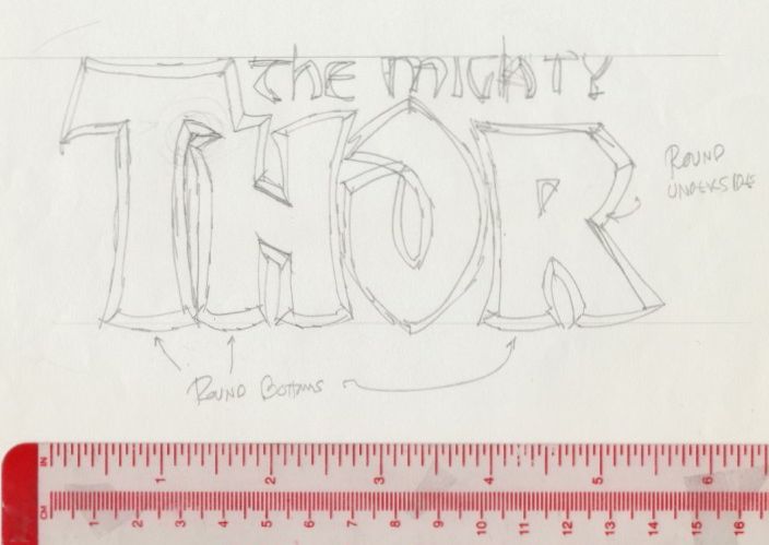
On Tuesday last week, I attended a reception for “Larry Hama: Artist-in-Residence” and the reinstallation of “Marvels & Monsters” at the Asian/Pacific/American Institute at New York University. I’ve known Larry since 1978 and designed a few logos for him: Bucky O’Hare, Conan Saga, Machine Man (Barry Smith), and Savage Tales.

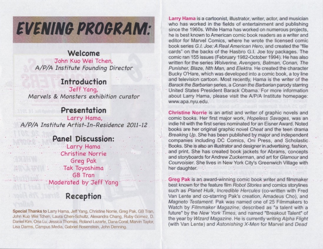
Below are scans of the reception program, the “Larry Hama: Artist-in-Residence” brochure, and the “Marvels & Monsters” brochure poster. Please visit the Asian/Pacific/American Institute website and gallery, 41–51 East 11th Street, Manhattan.


(Next Monday: “Anatomy of a Logo: Marvel”. The logo was done for the 1991 Abrams book, and later it was applied to books, publications, software, toys, etc.)

Monday, September 26, 2011

Street Scene: Stanton Substation


N E W Y O R K C I T Y
163 Essex Street, Manhattan


One block north from Jack Kirby's birthplace.
Central Substation

(Tomorrow: Larry Hama at New York University)

Monday, September 19, 2011

Street Scene: Jack Kirby's Birthplace


N E W Y O R K C I T Y


Standing in front of 147 Essex Street
and looking southeast. The blue building

Jack Kirby’s father, Ben, signed his World War I draft card on
June 5, 1917; an image of the card was found at Ancestry.com. 
The address is quite legible. On August 28, 1917 Jack was born. 
Martin Bartolomeo wrote about Jack’s childhood neighborhood
in the Jack Kirby Collector, number 53, on pages four and five.
To learn more about Kirby, visit the Jack Kirby Museum website,
the TwoMorrows Publishing website, and the Facebook album.

Thursday, September 15, 2011

Anatomy of a Logo: The Mighty Thor, Part 8


SUNDAY, JUNE 26, 1983

I begin work late in the morning. From the pencil rendering I make a marker comprehensive (comp) of the logo before starting the finished art. I get a good sense of the line weight for the letters and beveled edges.


After examining the comp I see the need for minor adjustments. I place tracing paper over the comp and make a couple of notations in red.


I make a photostat of the pencil rendering; it is made at 150 percent of the original. I use a T-square to square-up the photostat on the lightbox, then I tape it down. On top of the photostat I secure a sheet of LetraMax paper. I begin penciling the logo using a variety of French curves and ellipse templates. The inking is done with Rapid-o-graph technical pens. I correct inking errors either by scratching away the ink or covering it with white gouache.


I finish in the early evening. I mount the "Thor" LetraMax sheet on illustration board, then add a flap of heavyweight paper to protect the art. "The Mighty" was drawn separately and slightly larger than the space alotted. I make a photostat of "The Mighty" then affix it to the "Thor" art.


MONDAY, JUNE 27, 1983

Walt arrives at my studio to pick up the logo and deliver it to Marvel.


SEPTEMBER 1983

The Mighty Thor logo debuts on issue 338. When Walt picked up the logo, I was kidding when I told him I wanted to see my credit in large letters. Well, there it is on the letters page.


Walt and me at the 2007 Big Apple Con in New York City.


(Photo post on Monday; and I contribute
cartoonist profiles to the Stripper's Guide.)

Wednesday, September 14, 2011

Anatomy of a Logo: The Mighty Thor, Part 7


SATURDAY, JUNE 11, 1983

I make a tight pencil drawing of "Thor" for evaluation.


MONDAY, JUNE 20, 1983

I see a few problems and make minor adjustments to the stroke width (marked in red) and to the width of the "H".


On the sheet below, there are subtle differences between the two logos. I draw red guides lines as I prepare to make another tight pencil drawing.


With the new pencil rendering, I place it over the first one for comparison.


THURSDAY, JUNE 23, 1983

When Walt calls, I say the logo will be ready on Monday.


(Tomorrow: Part 8 of 8)

Tuesday, September 13, 2011

Anatomy of a Logo: The Mighty Thor, Part 6


WEDNESDAY, JUNE 8, 1983

I work on refining "The Mighty" letterforms. Using tracing paper is a back-and-forth process. On the sheet below, I roughed out the letters in the top sketch. I place another sheet (see the second one) on top of the first one and refine the letters. Then I place the first sheet on top of the second and repeat. A third sheet is used to continue the process, and so forth. The version, to be used as a guide for the finished art, is at the bottom of the third sheet.


(Tomorrow: Part 7 of 8)

Monday, September 12, 2011

Anatomy of a Logo: The Mighty Thor, Part 5


SATURDAY, JUNE 4, 1983

This sheet (scanned and stitched together) shows an early logo revision based on Walt's sketch. Around the logo are alternate versions of the "R", which I drew the following day.


Below is the next revision with slight changes to the beginning and end strokes of the "O" and to the leg of the "R".


SUNDAY, JUNE 5, 1983

A detail from the sheet with alternate "R" designs I drew at 4:20 pm. The second "R" would be used in the final logo. The other versions have too many facets.


TUESDAY, JUNE 7, 1983

I make variations of the logo, and then evaluate them. On the sheet below, I put small check marks above the "O" and "R" to tell myself to use these versions. And I make a note to draw a wider crossbar on the "T" as I did on the bottom logo of the second sheet.


(Tomorrow: Part 6 of 8)

Sunday, September 11, 2011

Anatomy of a Logo: The Mighty Thor, Part 4


MONDAY, MAY 23, 1983

These are the two sheets I will fax. The first two logos, in the top sheet of runic-style letters, are basically the same except one is more angular than the other. The cross strokes of the "T", in both, are pointed, while the "T" in the bottom logo has a flat top and is angled inward. (The scanner altered the color of the ink.)


The bottom sheet (below) has the broad pen designs. For "The Mighty" I alternate between runic-style letters and uncials. The open "O" adds character to the logo.


TUESDAY, MAY 24, 1983

Walt calls and says he likes one of the designs and wants to get together. I don't recall where we met, but he made a sketch of the logo with a significant change to the "R". His sketch was based on my broad pen designs, in particular, the second one, but now the "R" has more in common with the runic-style letters. He prefers the letters on the same baseline, and emphasizes the bottom of the strokes are to be round.


WEDNESDAY, JUNE 1, 1983

Walt says the logo is due in late June.


(Tomorrow: Part 5 of 8)

Saturday, September 10, 2011

Anatomy of a Logo: The Mighty Thor, Part 3


FRIDAY, MAY 20, 1983

Around noon, Walt calls to get a progress report. I say something like, "The sketches are coming along just fine. I'll fax them on Monday."


SATURDAY, MAY 21, 1983

In the morning I'm busy making new sketches and refining them; below are a series of tracing paper sketches. I use a black Pentel pen to draw the logos. (The scanner altered the color in some areas.)


Above: In the she sketch at the bottom of the sheet, I see some possibilities in aligning the angle of the bottom of the "T" and "H", and using that angle in the "R". I try to create a stroke that mimics the stroke of a broad pen.


Above: The top logo sketch is a refinement of the sketch in the first sheet. I complete the letters' beveled edge by adding shadows.


Above: I develop further the runic-style logo, and try a shadow and beveled edge on two sketches. When I make these drawings, I do not use any reference.


I settle on two designs and do three variations of each in the afternoon.


(Tomorrow, Part 4 of 8)

Friday, September 9, 2011

Anatomy of a Logo: The Mighty Thor, Part 2


WEDNESDAY, MAY 11, 1983

At the Upstart Associates loft, Walt showed his Thor concept sketches. His reference was the Book of Kells and runic letterforms. And he provided a photocopy of the original Thor logo (the last of the 1960s Marvel superhero logos to change) as well as a photocopy of his cover mock-up of Beta-Ray Bill smashing the old logo. Lastly, he said the logo was due in mid-June.


After lunch, I return to my studio and made a few quick pencil sketches. On the tracing paper sheet, the "T", in the sketch, below, was shaped to resemble the hammer's head.


Below, I made a tight tracing of my first sketch. Most of "The Mighty" uncial letterforms would find their way in the logo.


On the backs of three eight-and-a-half by eleven-inch sheets, from a discarded manuscript, I penciled a few more designs. The runic characters played a prominent part in the words "The Mighty". Walt's slanted crossbar in the "H" was a distinctive element I wanted to use. Pressed by other assignments, I filed the sketches away.


(Tomorrow: Part 3 of 8)