Around 10 o’clock in the morning on March 23, 1992, DC designer Robbin Brosterman called and offered the Ironwolf graphic novel logo to me. I accepted. The next day a two-page fax arrived. The first page was her cover layout and the second was an ad for the book with an Ironwolf logo by Todd Klein from 1987. (The book collected the three Ironwolf stories from the 1972 Weird Worlds issues 8, 9, and 10.) I called Robbin and we discussed the logo design. She wanted the logo to match the width of the box for the art. The lettering should be tall and condensed, and perhaps similar to black letter or with elements from Klein’s logo. On the fax, I made a note that sketches were due April 3.


On March 31, I began work on the logo. For one design I used Gothic Tuscan Pointed from Rob Roy Kelly’s 100 Wood Type Alphabets published by Dover. In place of the “W” I inverted the letter “M”, so almost all the vertical strokes were parallel.

On tracing paper, I outlined the Gothic Tuscan font without the points on the baseline. The second sketch used the pointed elements of the logo in the ad. On the bottom sketch I stripped away most of the serifs and made the letters angular. Then I refined the sketches.


On April 2, a photocopy of the designs were faxed to Robbin. She called back and wanted to use design number two with some modifications: taller letters, new design for the “I” and more space at the top angled stroke of the “W”.

Later that day I made two photocopies of the design. I trimmed one of them and pasted it over the other; you can see where by the yellow rubber cement stains. I changed the ”I” and adjusted the height of the strokes in the “R” and “F”.

This design was faxed to Robbin and she approved it.

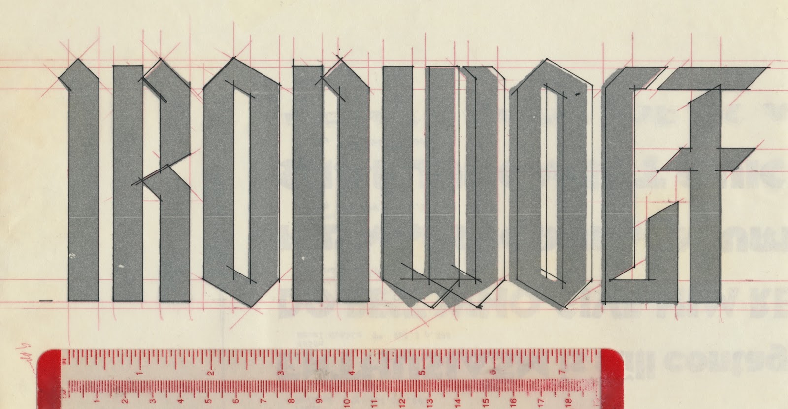
On April 9, I enlarged the design and carefully measured the the width and angle of the letter strokes in red.

I placed tracing paper over it and made more modifications. The width of the logo was constant with a significant change to the design of the “W”, minor changes to the “O”, “L”, and letterspacing adjustments.
I positioned the tracing on a light box then a sheet of LetraMax was placed over it. The inking was quick and easy.


Ironwolf: Fires of the Revolution was published August 1992. Robbin did a superb book and jacket design. The paperback edition was released April 1993.

At this year’s New York Comic Con, I saw Howard and returned some artwork I had misplaced. On the topic of digital tablets and smartphones he doesn’t care for them as a way to read comics. He said he’s a “page layout guy” and these digital devices obviate his skillset. A couple of days later, I recalled Norma Desmond’s line, “I am big, it’s the pictures that got small!”, from Sunset Boulevard: “Comics are big. It’s the screen that got small.” Of course, you could substitute movies, magazines, etc. for comics.
(Next post Saturday: Ed Benguiat)
Wow.
ReplyDeleteWhat an amazing blog. It's about all my favorite things.
Great Blog
ReplyDeleteBeautiful and perfect logo art.
ReplyDeleteI visit this entry on the IRONWOLF logo every so often, it gets my creative juice moving!! You do great work, thanks for sharing!!
ReplyDelete