
Marvel By Design: Graphic Design Strategies of the World’s Greatest Comics Company is published by Gestalten. The book has excellent design and superb printing. On pages 28 and 29 is “How Marvel Became Marvel” which shows the evolution of the Marvel logo. (The spread is at the Gestalten website.) A brief history of the company, illustrated with the Timely Comics shield and Atlas globe, is on page 28. Seven versions of the word Marvel, arranged chronologically, are on page 29.
This post takes a closer look at the graphics presented in “How Marvel Became Marvel”.
Fantastic Four #1 had a November 1961 cover date. A box with an uppercase M and lowercase C appeared under the Comics Code Authority stamp of approval. The two letters appear to be a type font. Stan Lee would have approved the design which may have been designed by Sol Brodsky, Marvel’s head of production. (Two versions of the Mc debuted on two of the ten issues dated June 1961: Journey Into Mystery #69 and Patsy Walker #95.)
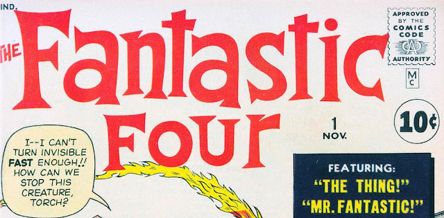
The Mc design was the opposite of National Comics’ DC bullet.

Detective Comics #297, November 1961
A new design for the cover was introduced with the May 1963 issues and April issue of Patsy Walker #106. In the upper left corner, a vertical box had three elements: face(s) of the character(s), Marvel Comics Group and the price. Marvel Comics Group was typeset in a font similar to Futura Bold. The price was hand-lettered and picked up from earlier issues with the price in a circle. Steve Ditko came up with the idea for the corner box character(s).
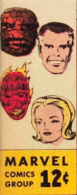
Fantastic Four #14, May 1963
The forty-second issue of Fantastic Four, September 1965, introduced Marvel Pop Art Productions which replaced Marvel Comics Group. I believe Sam Rosen did the lettering. This change is mentioned on page 17 of Marvel By Design.

Marvel Comics Group returned to the box in Fantastic Four #46, January 1966.

Two months later, the price was removed from the box and Marvel Comics Group was made bigger and bolder. I believe Sam Rosen did the lettering.
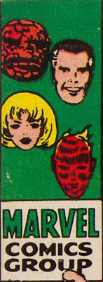
Fantastic Four #48, March 1966
Marvel introduced a new cover format with the November 1971 issues. Marvel Comics Group, typeset in Franklin Gothic Bold, was placed in a banner.

Fantastic Four #116, November 1971
A large stylized M, incorporating the prices, issue number and month, appeared on comics dated October 1982. The designer of the M is not known.

Fantastic Four #247, October 1982
One year later Marvel returned to the vertical box design which used the large M with Marvel typeset in a font similar to Helvetica Inserat.

Fantastic Four #259, October 1983
To celebrate Marvel’s twenty-fifth anniversary, a new design featured a hand-lettered outline of Marvel and telescoping lines, with an outlined 25th overlapping them, plus the typeset Anniversary.

Fantastic Four #290, May 1986
Marvel was typeset in Futura Condensed Extra Bold Oblique for issues dated April 1987. The M was replaced by a box with the prices, issue number and month, and the Comics Code Authority stamp.

Fantastic Four #301, April 1987
The M returned with Marvel on top and Comics, hand-lettered and overlapping it, on issues dated February 1990. The designer has not been named. (In 1991 a trademark application was filed for use on wearable merchandise.)
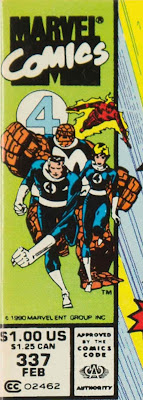
Fantastic Four #337, February 1990
In 1991 Abrams published Marvel, Five Fabulous Decades of the World’s Greatest Comics. I designed a logo for the book. Here are links showing how the logo was created: Part 1, Part 2, Part 3 and Part 4. This logo was used on calendars, toy packages, video games, annual reports, gum ball machines, etc. I show my logo because I see a connection between it and the current Marvel logo.

A decade passed when a redesigned Marvel logo debuted. Marvel By Design said “Marvel’s leadership worked with a team of designers to overhaul the comics logo into something more functional and streamlined. ...” Unfortunately the names of the designers were not revealed. I believe Ultimate Spider-Man #1, October 2000, was the first appearance of the new logo that later became known as the red brick logo. The letterforms resemble the font Trade Gothic Next Heavy Compressed. In the new logo, the letters are tightly spaced, with almost all of them touching. The same characteristics are in my design.

The second issue of the Ultimate Spider-Man used Marvel in a font similar to Impact Bold. Issue twelve used a version with letters expanded horizontally. This design was replaced by the red brick logo on issue 50.

Some titles, cover dated June 2001, sported a banner with Marvel Comics typeset in Futura Condensed Extra Bold. The upper left used the large M overlapping the bottom of a circle with the character(s). The banner ended with the November 2002 titles. Soon the red brick logo appeared on all titles.

The Amazing Spider-Man, Volume 2, #30, June 2001
The red brick logo letters appeared in Marvel movies beginning in 2002.

Spider-Man, 2002
In 2016 Rian Hughes modified the red brick logo. To my eyes, the M is too narrow.

Sidebar
There were other companies named Marvel that used sans serif, bold condensed fonts or lettering for their trademark. Below are samples from the Official Gazette of the United States Patent Office.

February 2, 1948

April 12, 1949

October 18, 1949
(Updated December 16, 2021. Next post on Monday: Marvel By Design–The Index and Art Credits)
Great article !! I have been seeing this design since my childhood. These are my really favorite designs. Thank you for sharing this amazing article.
ReplyDelete