Monday, January 3, 2022

Comics: Jim Novak, Letterer


James Richard “Jim” Novak was born on September 14, 1955, in Chicago, Illinois. His middle name was found in a family tree at Ancestry.com. The birth information is from Wikipedia. Novak was the first of four children born to George Andrew Novak, a Chicago native, and Aleksandra Klimuk, a naturalized Russian according to the 1940 U.S. Federal Census. A passenger list said she arrived in the United States on March 31, 1939. 

Novak’s parents were students at Chicago’s Kelly High School. His father was in the Class of 1949 and his mother in the Class of 1951. 


They married on May 26, 1951 according to the Cook County, Illinois Marriage Index at Ancestry.com.

The names of Novak and his siblings, Patricia, Timothy and Carol, were in the Chicago Tribune obituaries of their mother (November 13, 1932–April 25, 1985) and father (April 24, 1930–January 27, 2003). 

The Novak children attended Proviso West High School in Hillside, Illinois. Hillside is 14 miles (22.5 kilometers) west of Chicago. Below are Novak’s 1971 and 1972 class photographs from the yearbook, The Mural. 


Novak’s senior photograph was not in the 1973 yearbook but he was pictured on the Mural’s staff page. He created and drew the character, Freddie, who appeared throughout the yearbook. Novak also lettered the five section spreads.


Novak was interviewed in David Anthony Kraft’s Comic Interview #1, February 1983. Below is an excerpt. 
DAK: What decided you on lettering?

Jim: I was always interested in every facet of comics. I had and still haver a twelve-by-twelve foot room in my parent’s basement. I used to go down there and do the writing, drawing and lettering on a whole book of my own at about age thirteen, fourteen or fifteen. There was a guy who painted signs and he was looking for an assistant. 

I needed a job and said I could learn, so he hired me. It was pretty easy for me and I learned to design lettering. And I figured that was a good way to break into comics. I also learned how to use a pen and a brush and got to be pretty good. When I was seventeen, I went to New York and spoke to John Verpoorten at Marvel and he said he would let me know about a job. I was getting homesick and moved back. I told him I didn’t think that I could hack it in New York. About a year and a half later, I was working at the sign shop again and was really sick of it, because I had done everything there was to painting signs. That’s when I came back to New York but Marvel wasn’t hiring at the time. 

I went to DC and got my first job from Jack Adler for Wonder Woman. I was there for two or three jobs. I worked for Julie Schwartz. Then Marvel called me back and Sol Brodsky said they had a staff position. I felt it would be to my best interest to work on staff and get the benefit of other people’s experience. 

DAK: In the production department?

Jim: Right. That’s when I started to learn about lettering and I got better and better. A few of the people in the field who helped me out are Danny Crespi, who took me under his wing; Irving Watanabe, who gave me a lot of advice, and whose lettering you hear little about; and Gaspar Saladino, purely for style. Roy Thomas gave me Conan and liked my work. I was on staff almost three years. I thought then maybe I should freelance. Now it’s become a very good job. The comics work lead to the movie work and that led to other work. I’m turning away work, but I enjoy comics.
In the interview Novak said he married Lidia on July 10, 1982. At the time, they were living in Flushing, New York. Later, they moved to Huntington, Long Island, New York. 

The Grand Comics Database has many of Novak’s lettering credits. An overview of Novak’s work is at Who’s Who of American Comic Books 1928–1999. Below are logos by Novak.

Star Wars #1, July 1977

Power Man #50, April 1978

Daredevil #166, September 1980

Stephen King’s Creepshow, 1982

The Futurians, Marvel Graphic Novel #9, 1983

Comics Interview #1, February 1983

The Saga of Crystar #1, May 1983

Cloak and Dagger #1, October 1983

Marvel Super Heroes Secret Wars #1, May 1984

Web of Spider-Man #1, May 1985

Iron Man #200, November 1985

Elektra: Assassin  #1, August 1986

Last of the Dragons, 1988

The Infinity Gauntlet #1, July 1991

The Punisher: War Zone #1, March 1992

The Devil Dinosaur logo may have been designed by Novak; see Todd Klein’s blog. Three of Novak’s logos are in Marvel By Design (2021) on pages 59—Daredevil, Marvel Super Heroes Secret Wars; 114—Daredevil; 220, 227 and 228—Iron Man.

Novak passed away in mid-April 2018, in Long Island, New York. His passing was covered by Bleeding Cool, Multiversity Comics, and Previews World. Novak was fondly remembered by Eliot R. Brown and Pat Brosseau. 


Further Reading
Todd’s Blog, Jim Novak—Letterer and Logo Designer


Related Posts


(Next post on Monday: Alice Koeth, 1927–2020)

Monday, December 20, 2021

Under Cover: Marvel By Design—The Index and Art Credits


Marvel By Design: Graphic Design Strategies of the World’s Greatest Comics Company is published by Gestalten. The book has excellent design and superb printing. This post is about the index and amount of art selected per artist. 

The index, in general, is arranged alphabetically by chapter title. Each chapter has a numerical list of art exhibits with or without art and writing credits. Here are the indexed chapters in order of appearance.

A Brief History of Marvel
An Oral History of Dawn of X
How Marvel Became Marvel
Introduction: The Art of Designing Marvel
Marvel Beyond Marvel
Marvel’s Type
The Graphic Elements: Color Palettes
The Graphic Elements: Covers
The Graphic Elements in Focus: Black Panther
The Graphic Elements in Focus: Black Widow
The Graphic Elements in Focus: Captain America
The Graphic Elements in Focus: Captain Marvel & Ms. Marvel
The Graphic Elements in Focus: Fantastic Four
The Graphic Elements in Focus: Iron Man
The Graphic Elements in Focus: Spider-Man
The Graphic Elements in Focus: Storm
The Graphic Elements in Focus: The Winter Soldier
The Graphic Elements in Focus: Thor
The Graphic Elements: Layouts
The Graphic Elements: Lettering
The Graphic Elements: Logos
The Marvel Method: Then and Now

A lot of people made Marvel Comics what it was and is today and they deserve to be credited for their work. In the book there is room under every exhibit for a name or names. Instead, you have to look in the index for the credits which may or may not include names. For example, on page 39 of “The Graphic Elements: Covers” chapter is Jack Kirby’s cover for The X-Men #1. The index says “Uncanny X-Men (1963) #1 September 1, 1963” without crediting Kirby. The index for this chapter lists 101 covers (12 by Kirby) and credits just 33 artists. 

Here is a tally, with sources, of art by Jack Kirby who, sometimes, wasn’t credited in the text and index. Additions and corrections welcomed. 

Cover: Captain America–Captain America #109, January 1969
Page:/Exhibit Number–/Source
5: 1–The Avengers #3, January 1964
12: 2–Red Raven Comics #1, August 1940
22: 22–Marvel Treasury Special Featuring Captain America’s Bicentennial Battles #1, September 1976; index says Captain America Bicentennial Battles
39: 1–The X-Men #1, September 1963; index says Uncanny X-Men
41: 8–Captain America Comics #1, March 1941; 15–Tales of Suspense #4, July 1959
42: 16–Tales to Astonish! #1, January 1959; 19–Strange Tales #97, June 1962; 20–Journey Into Mystery #89, February 1963; 21-The Incredible Hulk #1, May 1962
43: 28–The X-Men #17, February 1966; index says Uncanny X-Men
44: 29 (corner box)–Sub-Mariner #1, May 1968
45: 32 (corner box)–Captain America #111, March 1969
46: 33 (corner box)–Silver Surfer #1, August 1968
47: 34 (corner box)–The Invincible Iron Man #1, May 1968
48: 35–Fantastic Four #33, December 1964
51: 53–Daredevil #1, April 1964 (with Bill Everett); 57–Tales of Suspense #39, March 1963
70: 3–The Avengers #4, March 1964
71: 5–Fantastic Four #51, June 1966
96: 66–Captain America Comics #1, March 1941
98: 72–Tales to Astonish #16, February 1961
100: 78–The Avengers #1, September 1963
102: 81–Captain America Comics #6, September 1941
131: 1–The Fantastic Four #1, November 1961
136: 5, 6, 7–Captain America Comics #1, March 1941; letterer Howard Ferguson not credited for exhibit number 8 in the index
140: 16–Strange Tales #97, June 1962
142: 24, 25–The Avengers #1, September 1963
143: 27–The X-Men #1, September 1963; index says Uncanny X-Men
144: 29, 31, 32, 33–The Incredible Hulk #1, May 1962; 30–The Incredible Hulk #2, July 1962
145: 34, 36–The Fantastic Four #1, November 1961; 35–Fantastic Four #14, May 1963; 37–Fantastic Four #51, June 1966
146: 42–Fantastic Four #51, June 1966; caption does not use the term Kirby Krackle
160: several panels are based on Kirby art
176: 83–The Fantastic Four #1, November 1961
189: 195–The Fantastic Four #1, November 1961
211: 1–The Mighty Thor #158, November 1968; not listed in the index
212: 1–The Fantastic Four #1, November 1961; 3–The Fantastic Four #6, September 1962
214: 7–Fantastic Four #17, August 1963; 8–Fantastic Four #71, February 1968; 9–Fantastic Four #106, November 1971
215: 20–The Fantastic Four #7, October 1962; 21–Fantastic Four #17, August 1963; 22–Fantastic Four #26, May 1964; 23–Fantastic Four #48, March 1966; 24–Fantastic Four #71, February 1968; 25–Fantastic Four #72, March 1968
220: 1–Tales of Suspense #39, March 1963; 2–Tales of Suspense #48, December 1963
224: 24–The Invincible Iron Man #1, May 1968; 25–Tales of Suspense #57, September 1964
227: 36 (corner box)–he Invincible Iron Man #33, January 1971; 37 (corner circle)–The Invincible Iron Man #46, May 1972; 38 (corner circle)–The Invincible Iron Man #71, November 1974
234: 1–Captain America Comics #1, March 1941; 2–The Avengers #10, November 1964; index credits Avengers Classic #10, May 2008, which reprinted The Avengers #10
238: 31–Captain America #100, April 1968; 35–Captain America Comics #1, March 1941; 36–Captain America #100, April 1968; 37–Captain America #109, January 1969
242: 1–Journey Into Mystery #83, August 1962
245: 19–Journey Into Mystery #89, February 1963; 20–Journey Into Mystery #123, December 1965; 21–Journey Into Mystery #125, February 1966; 22–The Mighty Thor #141, June 1967 
246: 23–The Mighty Thor #154, July 1968 
247: 24–Journey Into Mystery #104, May 1964; 25–Journey Into Mystery #125, February 1966; 26–The Mighty Thor #141, June 1967 
248: 39–The Mighty Thor #156, September 1968; 40 (corner box and background art)–The Mighty Thor #169, October 1969
250: 1, 3, 4–Fantastic Four #52, July 1966
256: 29–Fantastic Four #52, July 1966
262: 22–Tales of Suspense #53, May 1964
264: 1–Amazing Fantasy #15, August 1962
270: 45–The Amazing Spider-Man #1, March 1963

Below is an art tally for selected artists. Figures in parentheses represent the number of exhibits on a page. Additions and corrections welcomed. 

Jim Steranko, pages 6, 21, 42, 45 (3), 61, 66, 72 (2), 75, 78, 82, 88, 89, 91, 94, 98, 124–text about the X-Men logo, 140 (4), 143 (3), 149 (2)

John Romita, pages pages 16, 32–photo, 49, 60, 96, 142, 258, 261, 262, 266, 270 (3), 272, 274, 275

Steve Ditko, pages, 16, 17, 49, 70, 72, 75, 98, 140, 141, 190, 268, 269, 270 (3)

Walt Simonson, pages 23, 50, 55, 76, 112, 151 (5), 242, 247 (2), 248 (3) 

Frank Miller, pages 53 (3), 55, 81, 82, 84, 85, 95, 97, 150 (7), 262 

John Buscema, pages 42, 44, 46, 48, 74*, 77*, 99, 133*, 146* (3). *Index erroneously credits Gene Colan as the artist on The Silver Surfer #1, August 1968.

John Byrne, cover–Black Panther, pages 47, 50 (2), 52, 54, 55 (3), 102, 111 

Gene Colan, pages 42 (2), 47, 48 (2), 49 (3), 220 

Don Heck, pages 31, 96, 147 (3), 258 

Gil Kane, pages 86, 201, 234, 256 

Dave Cockrum, pages 17, 230, 232 

Alex Schomburg, pages 14 (2), 15 (3), 41 

Bill Sienkiewicz, pages 55, 92, 103 

Bill Everett, pages: 51, 80, 134 

Russ Heath, pages 15, 41 

Marie Severin, pages 21, 74 

Jim Starlin, pages 86, 97 

Herb Trimpe, pages 40, 83 

Neal Adams, page 65 

Frank Brunner, page 148

Sal Buscema, page 49

Howard Chaykin, page 52 

Ron Frenz, page 191 

Joe Maneely, page 42 

Moebius, page 74 

George Perez, page 91 


George Tuska, page 138 

Wally Wood, page 42 


Related Post


(Next post on Monday: Comic Book Trademarks, Part 5)

Monday, December 13, 2021

Under Cover: Marvel By Design—The Evolution of the Marvel Logo


Marvel By Design: Graphic Design Strategies of the World’s Greatest Comics Company is published by Gestalten. The book has excellent design and superb printing. On pages 28 and 29 is “How Marvel Became Marvel” which shows the evolution of the Marvel logo. (The spread is at the Gestalten website.) A brief history of the company, illustrated with the Timely Comics shield and Atlas globe, is on page 28. Seven versions of the word Marvel, arranged chronologically, are on page 29. 

This post takes a closer look at the graphics presented in “How Marvel Became Marvel”. 

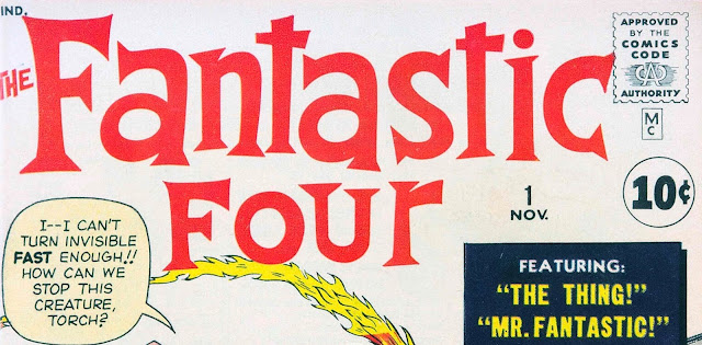
Fantastic Four #1 had a November 1961 cover date. A box with an uppercase M and lowercase C appeared under the Comics Code Authority stamp of approval. The two letters appear to be a type font. Stan Lee would have approved the design which may have been designed by Sol Brodsky, Marvel’s head of production. (Two versions of the Mc debuted on two of the ten issues dated June 1961: Journey Into Mystery #69 and Patsy Walker #95.) 


The Mc design was the opposite of National Comics’ DC bullet. 

Detective Comics #297, November 1961

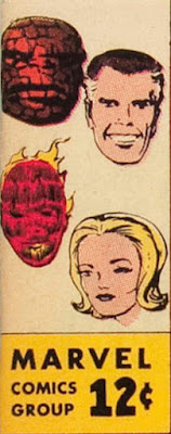
A new design for the cover was introduced with the May 1963 issues and April issue of Patsy Walker #106. In the upper left corner, a vertical box  had three elements: face(s) of the character(s), Marvel Comics Group and the price. Marvel Comics Group was typeset in a font similar to Futura Bold. The price was hand-lettered and picked up from earlier issues with the price in a circle. Steve Ditko came up with the idea for the corner box character(s). 

Fantastic Four #14, May 1963

The forty-second issue of Fantastic Four, September 1965, introduced Marvel Pop Art Productions which replaced Marvel Comics Group. I believe Sam Rosen did the lettering. This change is mentioned on page 17 of Marvel By Design. 


Marvel Comics Group returned to the box in Fantastic Four #46, January 1966. 


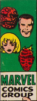
Two months later, the price was removed from the box and Marvel Comics Group was made bigger and bolder. I believe Sam Rosen did the lettering. 

Fantastic Four #48, March 1966

Marvel introduced a new cover format with the November 1971 issues. Marvel Comics Group, typeset in Franklin Gothic Bold, was placed in a banner. 

Fantastic Four #116, November 1971

A large stylized M, incorporating the prices, issue number and month, appeared on comics dated October 1982. The designer of the M is not known.

Fantastic Four #247, October 1982

One year later Marvel returned to the vertical box design which used the large M with Marvel typeset in a font similar to Helvetica Inserat. 

Fantastic Four #259, October 1983

To celebrate Marvel’s twenty-fifth anniversary, a new design featured a hand-lettered outline of Marvel and telescoping lines, with an outlined 25th overlapping them, plus the typeset Anniversary. 

Fantastic Four #290, May 1986

Marvel was typeset in Futura Condensed Extra Bold Oblique for issues dated April 1987. The M was replaced by a box with the prices, issue number and month, and the Comics Code Authority stamp. 

Fantastic Four #301, April 1987

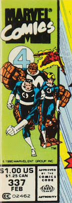
The M returned with Marvel on top and Comics, hand-lettered and overlapping it, on issues dated February 1990. The designer has not been named. (In 1991 a trademark application was filed for use on wearable merchandise.) 

Fantastic Four #337, February 1990

In 1991 Abrams published Marvel, Five Fabulous Decades of the World’s Greatest Comics. I designed a logo for the book. Here are links showing how the logo was created: Part 1, Part 2, Part 3 and Part 4. This logo was used on calendars, toy packages, video games, annual reports, gum ball machines, etc. I show my logo because I see a connection between it and the current Marvel logo. 


A decade passed when a redesigned Marvel logo debuted. Marvel By Design said “Marvel’s leadership worked with a team of designers to overhaul the comics logo into something more functional and streamlined. ...” Unfortunately the names of the designers were not revealed. I believe Ultimate Spider-Man #1, October 2000, was the first appearance of the new logo that later became known as the red brick logo. The letterforms resemble the font Trade Gothic Next Heavy Compressed. In the new logo, the letters are tightly spaced, with almost all of them touching. The same characteristics are in my design. 


The second issue of the Ultimate Spider-Man used Marvel in a font similar to Impact Bold. Issue twelve used a version with letters expanded horizontally. This design was replaced by the red brick logo on issue 50.


Some titles, cover dated June 2001, sported a banner with Marvel Comics typeset in Futura Condensed Extra Bold. The upper left used the large M overlapping the bottom of a circle with the character(s). The banner ended with the November 2002 titles. Soon the red brick logo appeared on all titles. 

The Amazing Spider-Man, Volume 2, #30, June 2001

The red brick logo letters appeared in Marvel movies beginning in 2002. 

Spider-Man, 2002

In 2016 Rian Hughes modified the red brick logo. To my eyes, the M is too narrow. 


Sidebar
There were other companies named Marvel that used sans serif, bold condensed fonts or lettering for their trademark. Below are samples from the Official Gazette of the United States Patent Office. 

February 2, 1948

April 12, 1949

October 18, 1949


(Updated December 16, 2021. Next post on Monday: Marvel By Design–The Index and Art Credits)